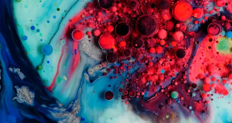
See how using complementary colors in a photograph transforms the image: the vivid contrast and visual harmony instantly capture the viewer’s attention.
The human eye instinctively focuses on vivid color contrasts due to an evolutionary requirement to identify primary objects. Ten thousand years ago, if you failed to notice the orange fur of a wild cat among the green bushes, it would certainly have cost you your life. The principle behind this protective mechanism has been successfully harnessed and adapted for the 21st century. Today, the use of complementary color in photography is a fundamental building block around which visual storytelling is constructed.
Don’t feel like reading the whole breakdown right now? Here’s a tighter, more practical summary of what actually changed.
Your AI-Powered Photo Editor for MacOS and Windows
Key Takeaways
- Complementary colours sit opposite on the wheel: this warm–cool tension keeps a photo vivid instead of letting tones blend into a dull, muddy mix.
- Street and reportage benefit from instant separation, like a bright yellow jacket against deep blue alley shadows—the subject reads three-dimensional even when it’s small in the frame.
- Portraits look brighter without heavy editing. Red hair against cool twilight or a turquoise dress is used as the example: cool backgrounds recede, warm subjects visually “step forward”.
- Architecture gains clarity through colour contrast: a yellow façade against a clean blue sky or cold metal against orange/copper backgrounds can emphasise texture and leading lines without extra sharpness work.
- Three pairings are treated as the core options. Blue-orange, red-green, and yellow-purple are presented as the most consistent complementary colour photography examples.
- Balance is defined by dominance and ratio: one colour can take up to 80% of the frame, while the accent sits on the subject; Goethe’s system is used to argue for orange-blue at 1:2, while red-green can work at 1:1 because their luminosity values match.
- The main problem is competing accents. Extra bright elements (signs, cars, passers-by) break the hierarchy, so the text recommends removing distractions with AI tools rather than losing a strong shot.
How Complementary Colors Enhance Visual Appeal
Working with color begins with identifying complementary pairs on the wheel, where the selected hues are directly opposite. A color palette for photography created using this principle leverages the constant interplay between warm and cool tones, preventing images from blending into a muddled mess or losing their vibrancy.
In street and reportage photography, this method helps instantly isolate the main subject from a chaotic crowd. A person in a bright yellow jacket against the backdrop of the deep blue shadows of a city alley will appear three-dimensional, even if they occupy only a small part of the frame.

Even a glance is enough to identify the core element of the scene that you need to focus on.
In portrait shooting, this method enables you to “bring out” the natural tones of skin or hair without aggressive editing. A red-haired model against a backdrop of deep twilight, or in a turquoise dress, appears several times brighter than in a neutral setting, as these colors resonate with each other.

Complementary colors set each other apart, which helps highlight the human silhouette: a cool background visually recedes, while a warm subject literally seems to reach out toward the viewer.
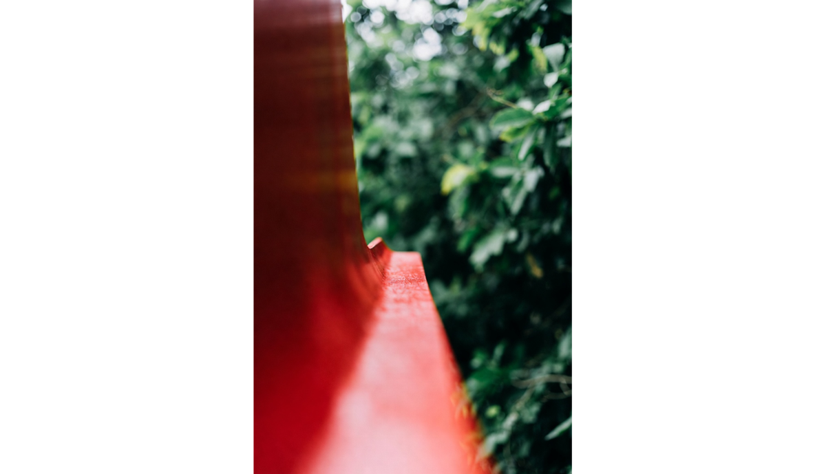
In architectural photography, the use of contrasting colors is particularly useful, as it eliminates the need to adjust sharpness and contrast in post-processing. The yellow facade of an old house against a clear blue sky looks harmonious, which helps emphasize the scene’s leading lines.

For the same reasons, metal details with a cold, steely sheen are often pictured against orange or copper backgrounds. This highlights the texture, making the reflections more striking and visually appealing.
Popular Complementary Color Pairings for Photographers
Most complementary color photography examples are based on the use of three color combinations. These colors are positioned directly opposite one another on Itten’s color wheel, thereby creating maximum visual impact.
- Blue and orange. This pairing shows up in nature all the time and still grabs attention because it contrasts color temperature: a warm sunset sky set against the cool blue of the water below.

- Red and green. This combo works in almost any proportion. Keep red as the main accent and let green build the backdrop, or balance both tones along lines in the scene so the frame feels cohesive. Either way, the contrast creates a strong, attention-grabbing image.
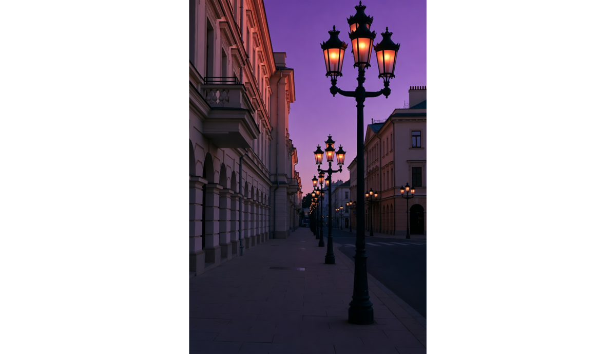
- Yellow and purple. This pairing is less obvious, but it can look striking and add a sense of luxury or soft nostalgia. Warm amber light from windows or old streetlamps contrasts with a deep purple evening sky, creating a rich but pleasant balance.


When using analogous color schemes photography, you can choose from pre-established combinations or try creating your own. To simplify the color selection process, use tools that generate palettes from photos. Upload an image you like from the internet so that Luminar Neo’s algorithm can identify the colors in it in just a few seconds. Integrating the palette into an existing project requires no third-party tools or manual color code entry.
Exclusive Tools of Endless Possibilities in One Editor
Techniques to Use Complementary Colors Effectively
Creating a striking image using the principle of complementarity revolves around the placement and balance of colors. The frame always features a dominant shade that occupies up to 80% of the space, as well as an accent that appears only on the main subject.
To determine the ideal color balance in a photograph, we use Johann Wolfgang von Goethe’s system, which was the first to assign numerical values to colors based on their effects on the human mind.

For colors in a pair not to clash but balance each other, their areas must be inversely proportional to their brightnesses.
For example, the combination of orange and blue is based on moderate contrast, where, according to Goethe’s color wheel, the warm hue is exactly twice as strong as the cool one in terms of luminosity. To achieve balance, it is required to adhere to a 1:2 ratio, allocating two parts of the space to the calm blue and only one to vibrant orange.
The red and green pair is unique in that both colors have the same luminosity coefficient (6 to 6), meaning they are absolutely equal in psychological weight. This is the only combination in the system that theoretically enables a 1:1 division of the frame without one color clearly dominating the other.
Good photos can be taken even without adhering to the principle of contrast. Maintaining color balance helps direct attention and evoke an emotional response, making it easier to draw attention to the photo.
Inspiring Examples of Complementary Color Photography

When searching for references to create high-contrast photos, the focus is on selected color pairs and the shooting style. For example, to create a complementary color portrait, it’s best to emphasize the aesthetic of a city at dusk, where deep, cool shadows contrast with the warm orange glow of streetlights.
Those who specialize in landscape photography should look online for photos of poppy fields. Countless blood-red flowers contrast with the green meadow, drawing the eye into the distance. The even distribution of the accent color and the rich hue of the background harmoniously complement each other without blending into a monotonous mess.
If you can’t find suitable subjects, nothing is stopping you from using color photo editing software. Simply select the object, tweak a couple of sliders, and the purple flowers that were ruining the entire composition suddenly turn yellow. Editors with built-in smart tools are useful for making local adjustments. Remove an object and automatically fill the empty space using artificial intelligence, or replace it with a more suitable one in just a few clicks.
Elevate Your Photography with Our Advanced Software
Tips for Creating Striking Images with Complementary Colors

Analogous color schemes in photography serve as an effective compositional technique for creating a sense of depth. However, this isn’t a one-size-fits-all solution, and you cannot produce a perfect photo simply by selecting colors based on Goethe’s color theory.
Try to find additional visual cues by changing the camera angle or position. If you look at the main subject from different viewpoints, you’re sure to notice a leading line or an element that can serve as a background and create a sense of depth.
In harsh sunlight, complementary pairs appear more contrasting because the boundaries between light and shadow become sharper. On cloudy days, in the shadows of buildings, or as evening approaches, soft light begins to prevail. The contrast between colors doesn’t disappear: it’s just that, with the reduced emphasis, the viewer’s eyes will be able to notice other objects in the background.
Complete the picture during post-processing by making the surroundings more saturated using the color grading tool or by replacing individual objects to balance the scene’s richness. Modern photo editors like Luminar Neo let you change the weather in just a few clicks, adjusting the surroundings to the new conditions, so photos will definitely reach a new level.
Common Challenges and How to Overcome Them
The most common problem in color combination photography is an improperly balanced ratio. As mentioned earlier, red and green are the only pair where an equal distribution of accents across the image is acceptable.
Try doing the same thing with two other shades. Without a clear dominant color, it becomes psychologically more difficult to perceive contrasting images. The brain will start looking for a catch, causing discomfort and a strong desire to fixate on the image.
The complementary approach enables the use of several shades at once, but they must still be balanced with one another. A bright sign behind the model, a black car at the edge of the street, or a brightly dressed passerby will act as additional accents in the photo. They disrupt the composition and draw all the attention to themselves due to the sharp contrast. Use AI to remove objects so you don’t have to give up on a great shot because of one small detail.
Building Your Photography Skills with Color Theory

Using complementary colors turns a photo from a straightforward capture into a deliberate way to steer the viewer’s attention. The tension between warm and cool tones adds visual depth to the image, guiding the eye toward the main elements in the frame. eal control shows up in the balance: adjusting brightness and proportion so the colours support each other without making the image feel crowded.