Flowers have been part of portraits for years, centuries even, because they aren’t just popular in photography but have been used in painted portraits countless times. Does that mean it’s an overused prop to include? Absolutely not. I feel like flowers effortlessly bring more beauty into an image, solidify narratives and affect the mood. Simple yet effective, it’s definitely still worth shooting with them.
That being said, there are great portraits with flowers and those that fall a little flat. They are often used by beginners, but they struggle to use them effectively. On the other hand, fine art portrait photography delivers such impact and finesse with a solitary flower that others find so hard to capture.
So let’s look at ways to improve or get started with adding flowers to your portraits. I’ll go through a range of techniques and creative ideas, finishing it off with ways to get your photos to pop using Luminar Neo. Let’s get started!
Exclusive Tools of Endless Possibilities in One Editor
Using Flowers as a Frame
This is the easiest and most effective way to use flowers in your image. I often enjoy using props and elements in my images to add depth to my portraits, and using flowers is no exception.
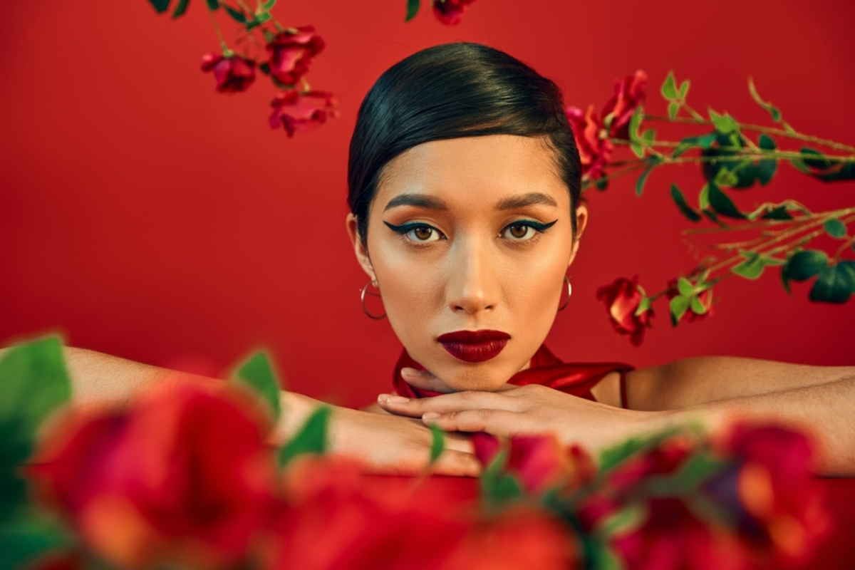
Here we can use flowers in the foreground and intentionally leave them out of focus to guide the eye beyond them and towards your subject, instantly creating depth in your image. Even though they are out of focus, the viewer will be very much aware of their presence. They will add softness to the image and an aesthetically pleasing pop of colour too.
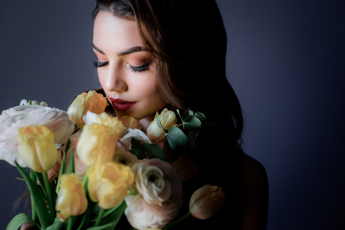
You can use flowers around your subject as well. Something like a flower arch can work, but we can also get more creative with it. For example, a subject posing holding a single flower or a bunch above their head, their arm slightly bent. Their arm and the flowers will then frame the face, leading the viewer’s eye.
So work on ways of using the flowers to frame the face, experimenting with them in different positions around it. It effortlessly helps you guide your viewer to your subject while at the same time adding interest. Like I said, easy and effective.
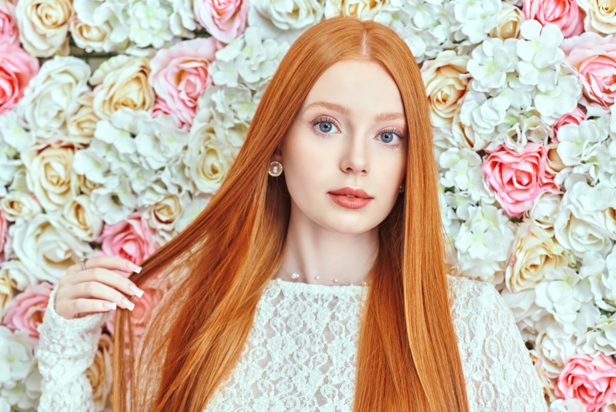
Control the Colour Palette
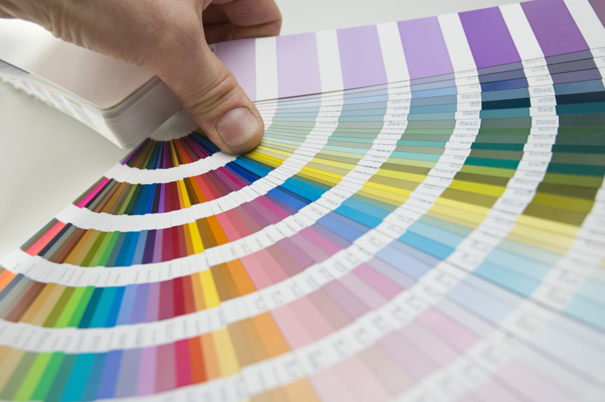
As I mentioned in the previous section, flowers can add a pleasing pop of colour, but one thing the pros understand is that this can be both a good or bad thing. Are you using a mix of colours or just a single colour? You’ll need to be very intentional with your choices here to avoid clashes and distractions.
You can absolutely go for extremely colourful compositions, but all of those colours need to harmonise with one another. Using something like a colour wheel will help you get the colours to work together to create a much stronger image. I will mention fine art portrait photographers again, as one thing that sets their photography apart from beginners is a strong understanding of colour theory.
Colours can clash too, which will instantly ruin the quality of your image. Red with green, purple with green, orange with green…actually, green is a pretty hard colour to work with, so it may be best to find other colours.
But jokes aside, the flowers, your subject’s outfit, the background, all of it needs to coordinate and harmonise with one another for an aesthetically pleasing image with strong quality.
The other issue is colours can dominate over one another, which runs the risk of you losing your subject in your composition, leading me nicely on to the next section of this article.
Elevate Your Photography with Our Advanced Software
Flowers Should Complement not Compete
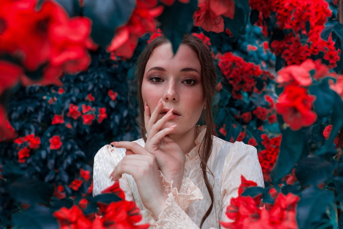
One huge mistake I made when I started portrait work was making the background more important than the subject. I typically shoot street portraits with neon lighting being a strong theme. When starting out, I was giving the neon lights more of a dominating space in the frame than the subject, which resulted in weak portraits.
The same can be said for flower portraits. So just remember that they are there to complement your subject, support themes and narratives, and create stronger compositions rather than compete for attention.
If you’re unsure how to do this, choose a white outfit for your subject. It instantly helps them contrast against the colourful array of flowers, drawing attention immediately to them. Then once you get more comfortable with colour theory, you can start bringing colourful outfits into your scene.
Working with Light
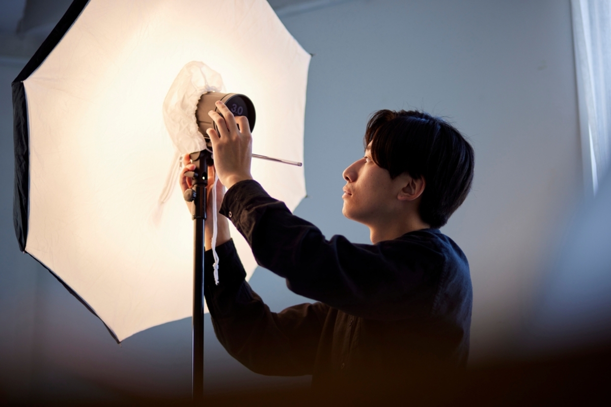
An ever-important component of portraits is lighting. It can make or break your shot, but we can also use it creatively, especially when it comes to flowers. In a recent article, I wrote about how I can use golden hour sunlight to pass through blossom petals to make them glow, and the same can be applied to the flowers in your photos.
This is achieved through back lighting, so shooting towards your light source with your subject and the flowers in between. You may need to bounce light back onto your subject’s face to ensure they are visible enough. But expect a much softer light, which ultimately is the most flattering light for portraits and works well with flower themes.
Harsh light can be used with flower portraits, but it has to be extremely controlled. Harsh light refers to non-diffused bright light such as a bare studio bulb or the bright midday sun. It is difficult to work with because it highlights blemishes in your subject’s skin and it also bleaches out colours. It does, however, create dramatic and impactful shots with dense shadows. If used well, it looks very artistic and eye-catching, but you will need to be mindful of the drawbacks.
Composition Ideas
So let’s now take a look at ways we can use flowers in your shots to really make them feel intentionally used, complementing your subject and even drawing a more artistic feeling in your images.
Flower Overload: This is where you get in as many flowers as possible and fill your frame with them. How you frame your subject is essential here. I would go for head and shoulders and no more than that. It means that your subject’s face will fill most of the frame and not get lost in the flowers. They could lie down with flowers around them, or you could cover a wall with them and have some placed in the foreground too.
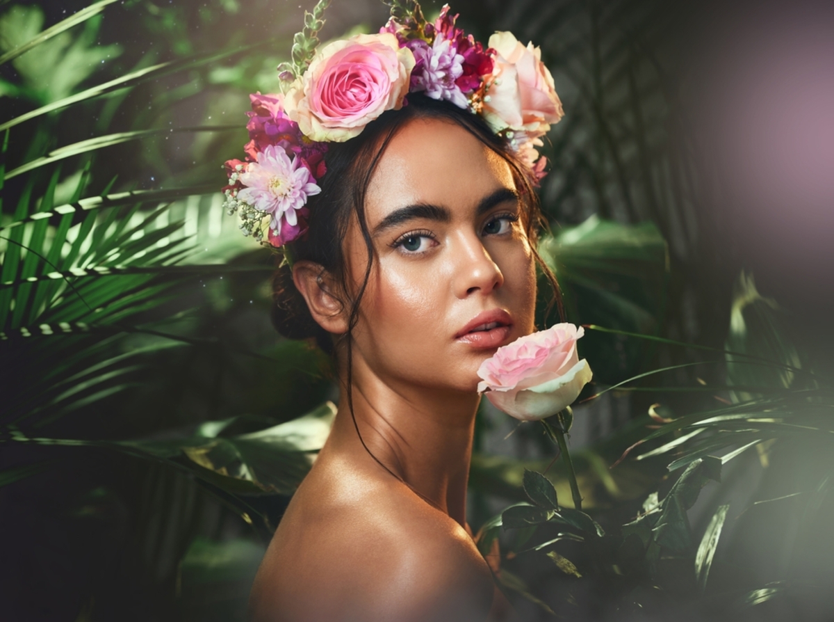
Flowers in the hair: Working with a hair artist, they can expertly place flowers in your subject’s hair for some beautiful portraits. Here you can use any kind of crop on your subject, but head and shoulders may be a good approach just to make it more obvious what you’re trying to achieve with your shot. You can draw inspiration from Frida Kahlo, who often used this theme!
Keep it minimal: A single flower can still deliver a massive impact. Minimal portraits often include a great deal of negative space, which feels as if it has been broken up by the presence of a subject. You can further break it up with your solitary flower, and perhaps it’s the only pop of colour in your shot, with minimal portraits also keeping a very limited colour palette.
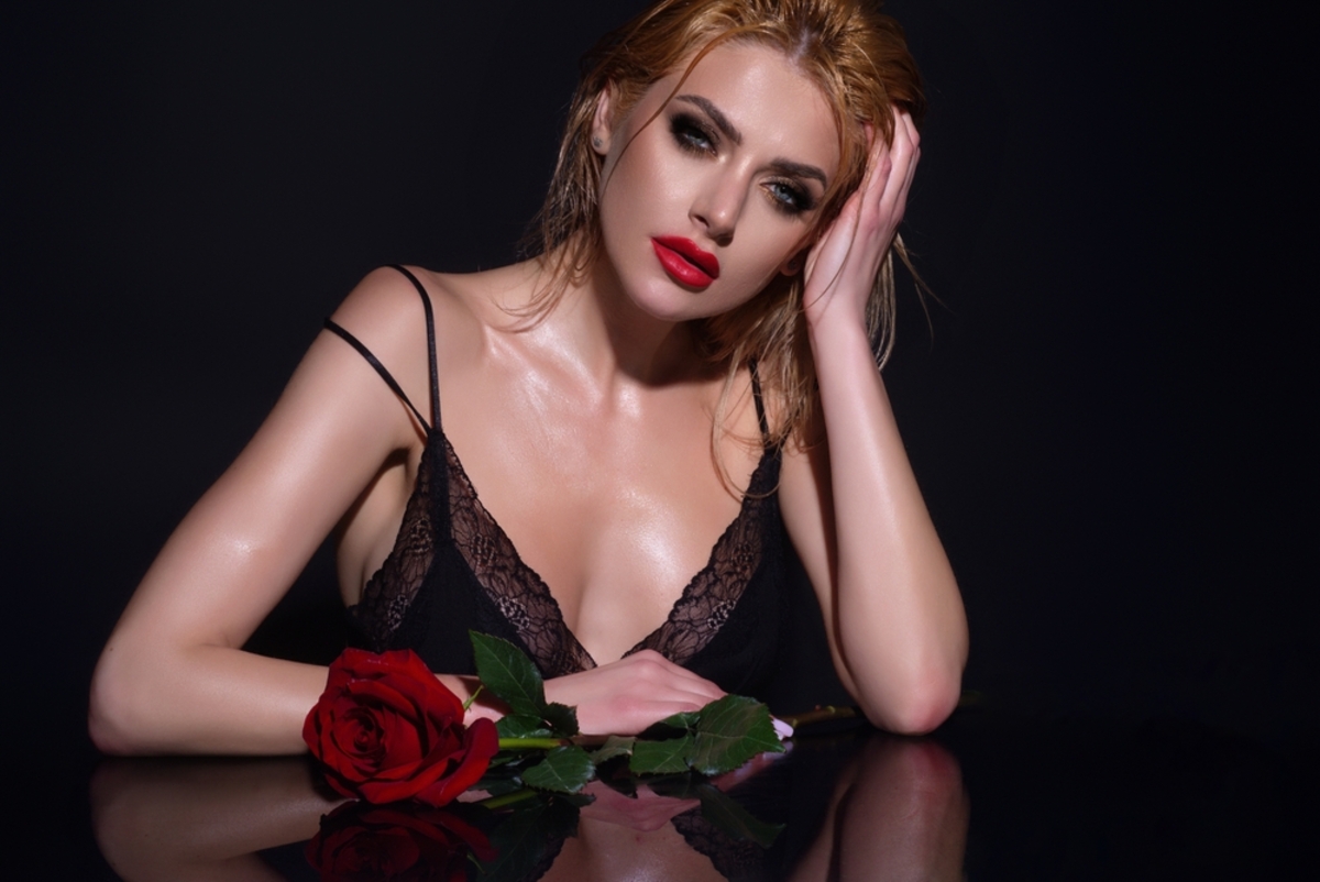
Focus on details: If you’re uploading a set of images, why not focus in on the flower to break up the set. You could frame the subject’s hand holding the flower, held loosely down by their side or resting on their shoulder. The way the flower is being held really helps shape the narrative you’re aiming to tell in your series. Held loosely with the flower pointing down suggests heartbreak. The subject pulling a petal from the flower suggests romance.
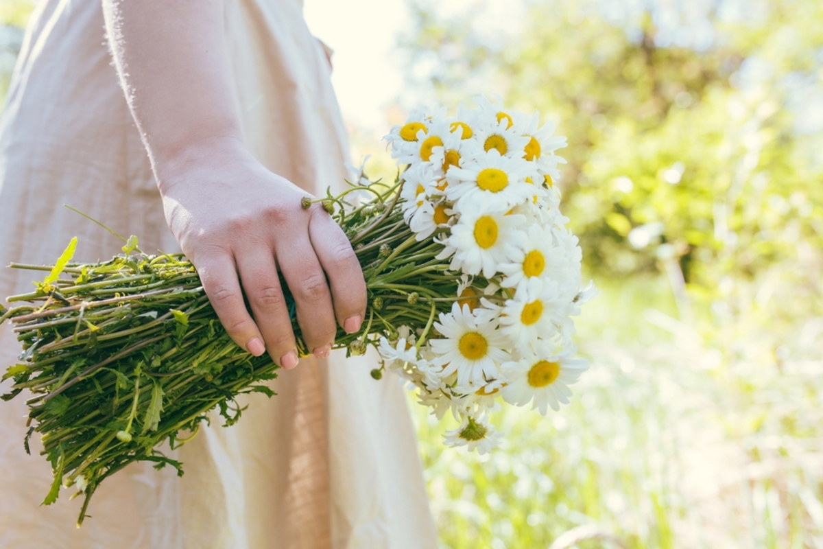
Holding bunches of flowers: This isn’t as easy to pull off as you may think. Firstly, we run into the issue of colour, as there is a lot going on when a subject is holding a bunch close to them. Your background should be very minimal, just a solid colour that complements the flowers. The flowers themselves should be carefully selected to harmonise with one another, and so should your subject’s outfit. The other issue is presentation. You can work with flower artists who will ensure the bunch is uniform and aesthetically pleasing, held in the right way. Then all your subject has to do is pose.
Editing Flower Portraits with Luminar Neo
Luminar Neo has a great deal of colour tools that you can utilise to get the best out of your flower portrait shot. Here are some of my favourites:
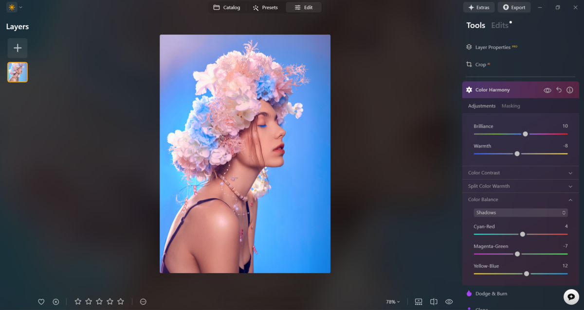
Colour Harmony: I use this tool often with colourful neon shots, and it will absolutely do the job for flower portraits.

Use it to get precise control over the temperature of your shot with Split Colour Warmth. Here I would absolutely make the warm tones more golden.
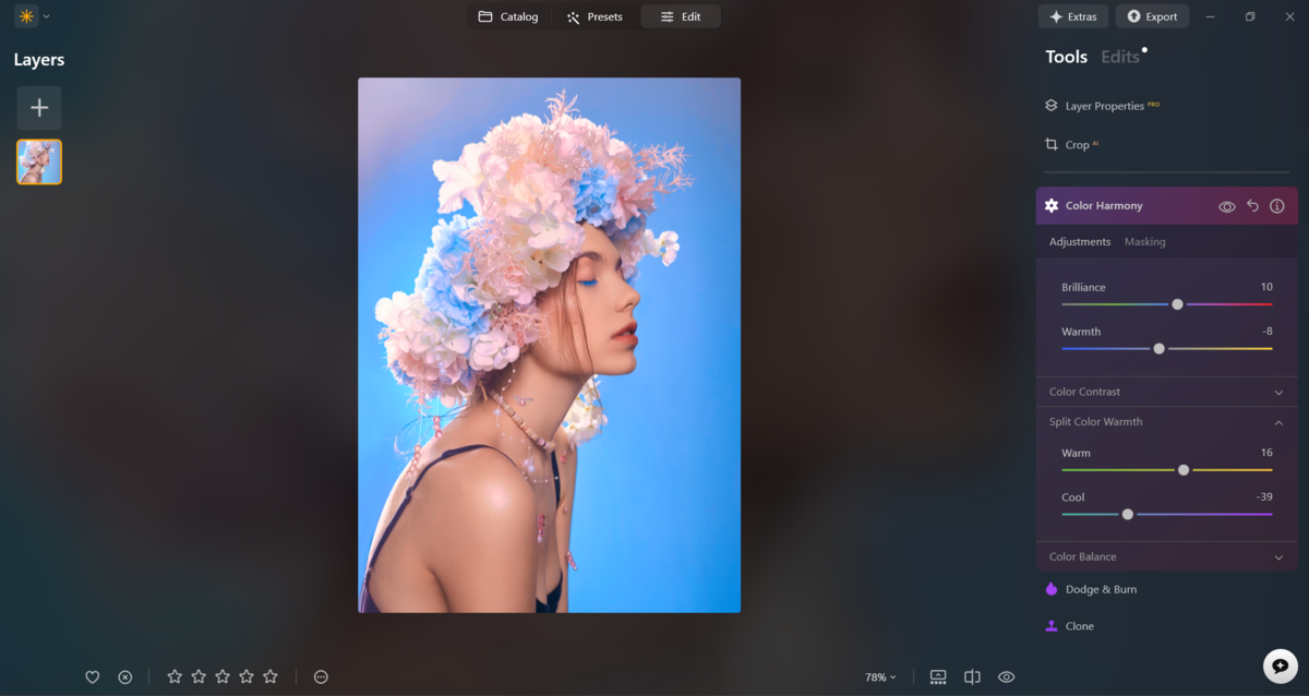
Then refine your tones with Colour Balance. Slightly nudge the shadows and midtones towards cooler tones and the highlights towards warmer tones for a nice contrast.
Portrait Tools: Luminar Neo comes with its own portrait retouching tools that should definitely be taken advantage of. Use these tools to smooth skin and remove blemishes, all with one click. But what really helps, especially with flower portraits, is drawing more attention to your subject. This can be done with the Face Light tool and eye tools. With the face slightly brighter, the whites of the eyes enhanced and the irises boosted, you immediately draw attention to your subject, helping avoid flowers competing for attention.

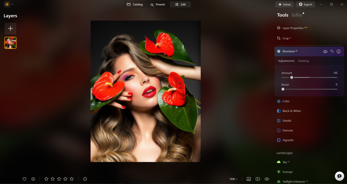
Structure: This is definitely one of my go-to tricks when editing portraits like this. Flowers carry a strong sense of softness, and that can be enhanced in your edit. Use the Structure tool and drag the slider to the left to soften details and clarity. This will instantly transform your image and is well worth trying.
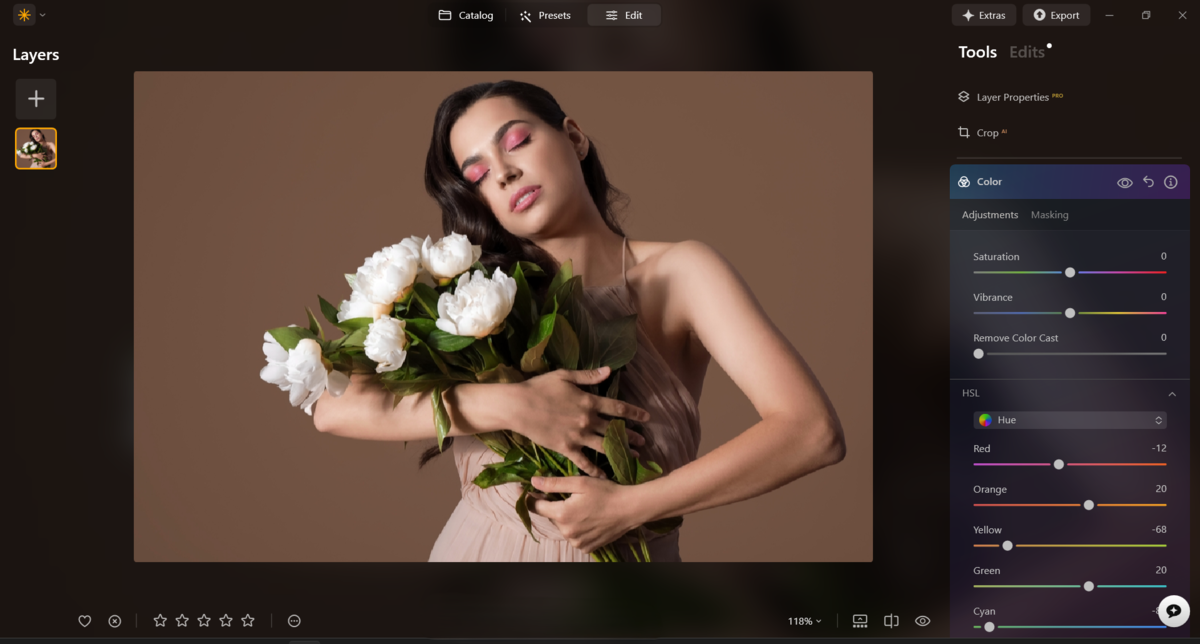
HSL: Hue, Saturation and Luminance, found inside the Colour tool, are where I always finish my edits. I use these to fine-tune the colours in my image, bringing everything into better harmony. With your understanding of colour theory, you can reduce any clashing tones and boost those that complement each other for a more refined result.
Your AI-Powered Photo Editor for MacOS and Windows
The Bottom Line
With spring now finally here, flower portraits are certainly going to be on trend, and with what you’ve learned here today, you’ll be well on your way to creating portraits that feel like fine art rather than simple attempts at something pretty.
Flowers are timeless props that support themes and narratives in your shot and create an overall pleasing aesthetic. But their colourful nature can be a hurdle, so by using colour theory you can make sure they complement your subject rather than compete or clash with them.
So go out, grab a bunch, and get shooting!