A food photography background shapes the mood, contrast, and visual focus of the image. Here’s how to choose a surface that complements the dish without distracting from it.
You eat with your eyes first. Before tasting a dish, we notice its colors, textures, presentation, and the overall atmosphere of the image. That’s why food photography isn’t only about capturing what’s on the plate. It’s also about creating a visual setting that supports the dish and tells its story.
One of the most important elements in that setting is the background. The right surface can make a colorful dish stand out, reinforce a rustic mood, or provide a clean, minimal look. The wrong one can compete with the food, create distracting reflections, or make the entire composition feel unbalanced.
So how do you choose the best food photography background? Let’s look at the factors that matter most, from color and texture to scale, perspective, and context.
Don’t feel like reading the whole breakdown? We’ve pulled together a quick summary below.
Key Takeaways
Choose a background that supports the food rather than competing with it.
Use color contrast or harmony intentionally.
Match the background material and texture to the character of the dish.
Matte surfaces are often easier to control than highly reflective ones.
Consider the shooting angle before choosing the background.
Use contextual props when they help tell the story of the food.
Keep busy backgrounds under control by creating enough visual separation.
Test your setup with an empty plate or stand-in dish before the food arrives.
Prepare several background options before the actual shoot.
Use editing to refine the final image rather than relying on it to fix every composition problem.
Understanding the Role of a Food Photography Background
A background provides the visual foundation of a food photograph. It can establish a color palette, introduce texture, create a sense of place, and help direct attention toward the dish.
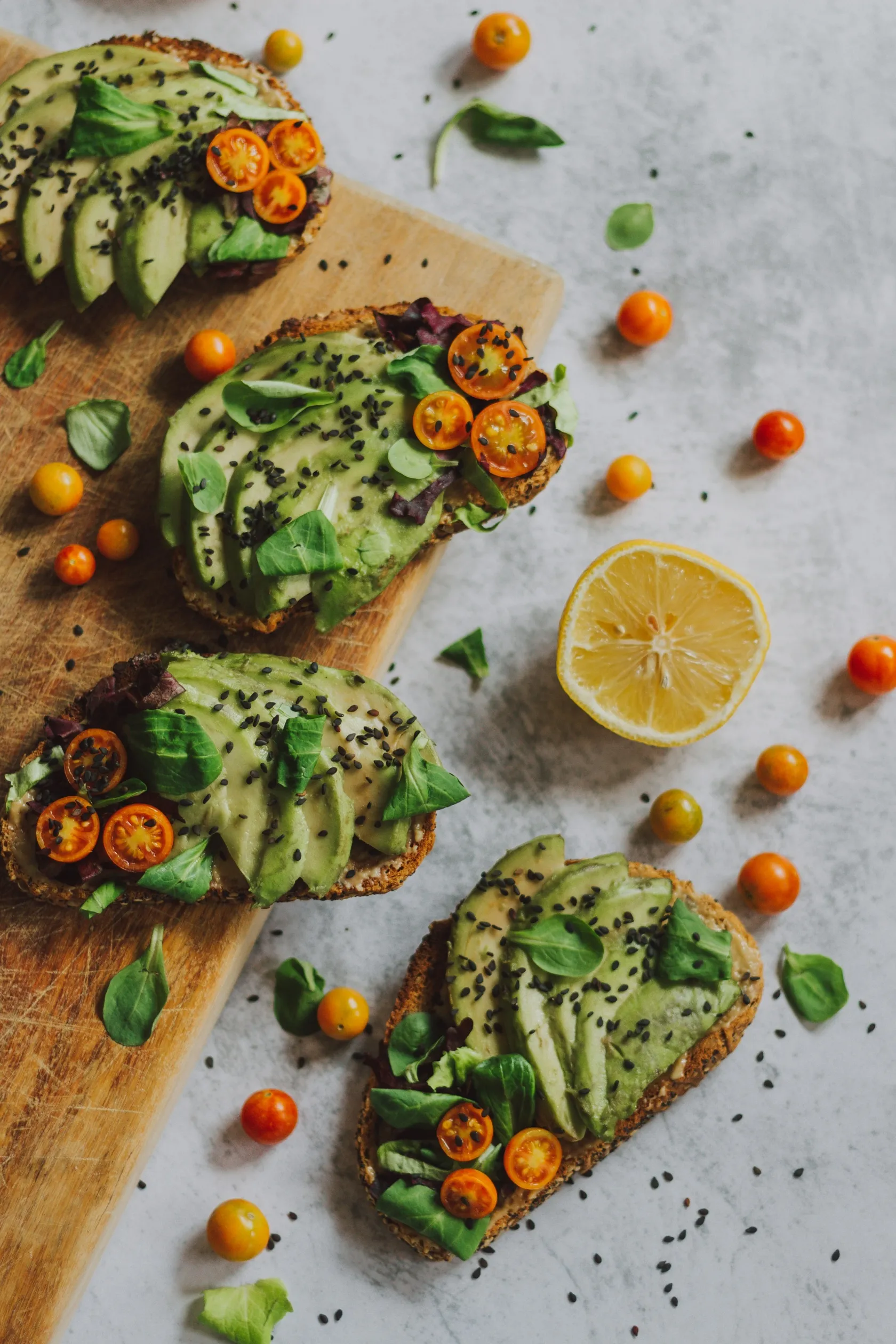
For example, a weathered wooden surface can support a rustic or home-cooking concept, while a clean stone or neutral-colored surface can suit a modern editorial image.
The background doesn’t always have to be literally behind the food. In an overhead photograph, the entire surface underneath the dish becomes part of the composition. In a three-quarter or eye-level photograph, the background may also include walls, furniture, fabric, or other elements farther behind the subject.
The main principle is simple: the background should support the story without becoming the story itself.
What to Consider When Choosing a Food Photography Background
1. Color Harmony and Contrast
Color is one of the quickest ways to influence the visual balance of a food photograph.
A background can harmonize with the food by using related colors, or it can create contrast that separates the dish from its surroundings. For example, a colorful plate may work well against a neutral surface, while a pale dish can stand out against a deeper background.
Think about the dominant colors in the food before choosing your surface.
A useful starting point is the color wheel. Complementary colors can create stronger contrast, while analogous colors can produce a more unified and subdued palette.
You don’t have to match the background to the food exactly. In many cases, a small amount of contrast is what prevents the subject from disappearing into the scene.
A background can be interesting without being visually complicated.
If the dish already contains several colors, ingredients, or textures, a simple surface may be the better choice. A plain board, neutral fabric, or understated tabletop can give the food enough visual space.
A more elaborate background can work when you’re creating a lifestyle scene or telling a story. The key is to establish a clear visual hierarchy.
Ask yourself:
What should the viewer notice first?
Is the background helping direct attention there?
Are any props brighter or more visually dominant than the food?
Does the background still work when the image is viewed as a small thumbnail?
If your eye keeps wandering away from the dish, simplify the setup.
3. Think About Scale and Perspective
The apparent size of your background elements depends on both the size of the props and your camera angle.
A large plate may need a relatively quiet surface, while a close-up photograph of a small dessert can benefit from subtle texture.
Perspective matters too. A background that looks beautiful from directly above may not work when the camera moves closer to eye level.
Before shooting, consider how much of the surface will actually appear in the final frame. There is no point choosing an elaborate tabletop if only a tiny corner will be visible.
4. Consider the Story Behind the Dish
A background can provide context.
If you’re photographing a traditional bread recipe, a wooden board, linen cloth, flour, and a few ingredients can suggest a homemade kitchen environment. A photograph of sushi might use restrained colors and simple materials that complement the clean presentation of the dish.
Contextual props can help communicate where, when, or how a dish might be enjoyed.
However, every prop should have a reason for being there. If an ingredient doesn’t contribute to the story, it may simply become another distraction.
This is especially important for food photography used in recipes, restaurant menus, cookbooks, and advertising, where the image often needs to communicate something specific about the dish.
5. Pay Attention to Texture and Material
Texture is another powerful way to create visual contrast.
Imagine a bowl of smooth soup photographed on an equally smooth surface. The result may be clean and minimalist, but it can also lack variation.
Adding a linen napkin, wooden board, rough ceramic plate, or lightly textured surface can introduce another visual layer.
Different materials also create different moods:
Background material
Visual effect
Wood
Rustic, warm, natural
Stone
Neutral, contemporary, substantial
Marble
Clean, elegant, editorial
Linen
Soft, casual, home-style
Ceramic
Refined, tactile, handcrafted
Paper
Minimal and controlled
Dark matte board
Dramatic and low-key
Metal
Industrial, modern, reflective
Texture should remain subordinate to the food. If the surface is so visually strong that you notice it before the dish, it may be doing too much.
6. Watch Out for Reflections
Some foods look particularly appealing because of the way light interacts with their surfaces.
Glazes, sauces, oils, fruit, chocolate, and beverages can produce attractive highlights. A highly reflective background can introduce competing reflections and bright spots, making the composition harder to control.
Matte or lightly textured surfaces are often easier to work with when you’re using directional lighting.
This doesn’t mean reflective materials should never be used. They can be effective for specific concepts, especially when reflections are intentional. Just make sure the reflection supports the image rather than distracting from the food.
Types of Food Photography Backgrounds
There is no single perfect background. Different types work for different visual goals.
Simple and Plain Backgrounds
A plain surface is a reliable choice when the food should be the clear focal point.
Neutral backgrounds such as beige, gray, cream, black, or muted brown are versatile and can work across many food photography styles.
You can also use a single strong color when it fits the concept. A bright background may suit fresh summer food, while a darker surface can create a more dramatic mood.
The simpler the background, the more important your food’s shape, color, and styling become.
Textured Backgrounds
Textured surfaces can add depth without requiring many additional props.
Wood, stone, linen, plaster, paper, and ceramic surfaces are common choices. Look for textures that complement the dish rather than compete with its details.
For close-up photography, keep the texture relatively subtle. A heavily patterned surface can become distracting when photographed at high resolution.
Your AI-Powered Photo Editor for MacOS and Windows
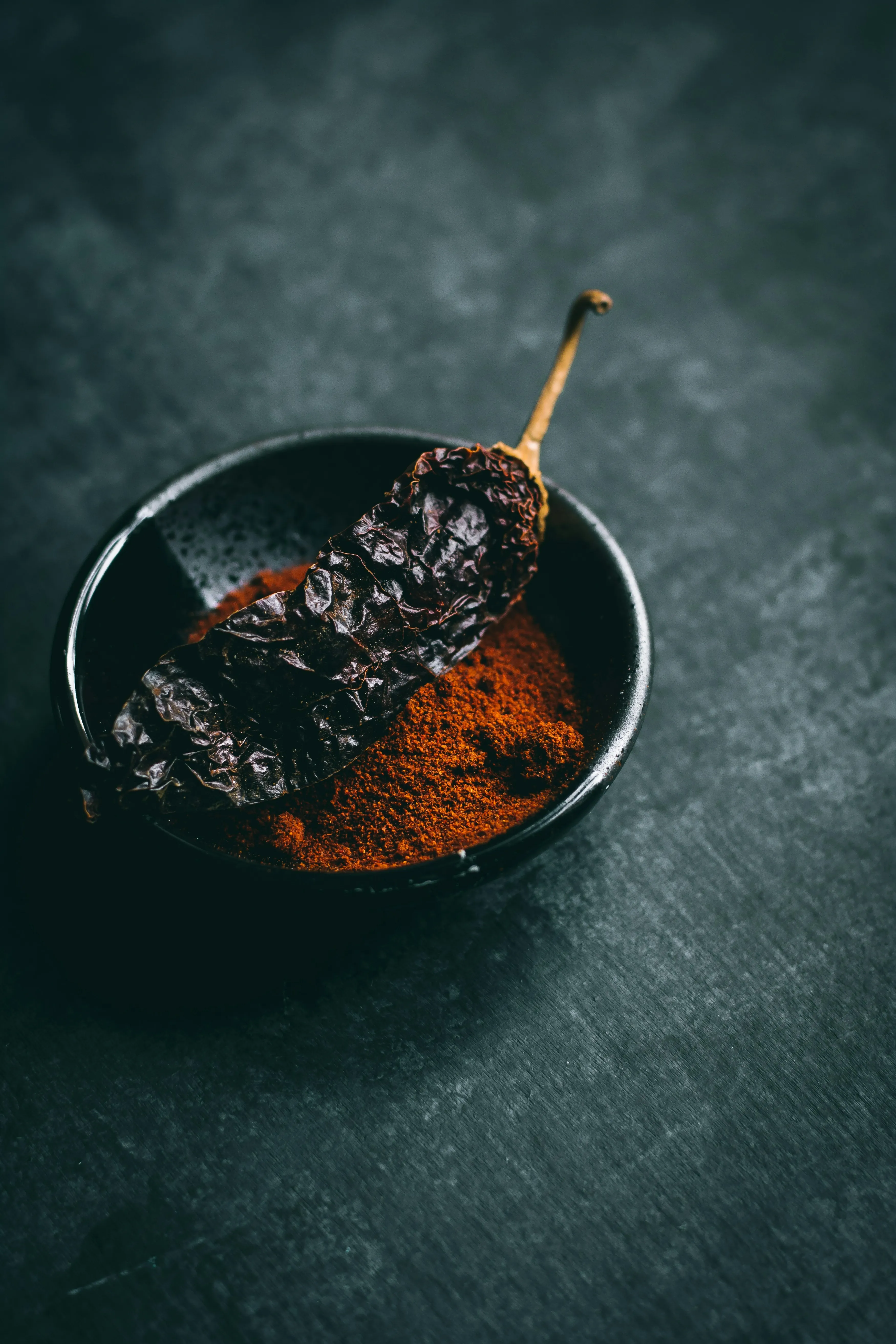
Dark surfaces can work particularly well for rich, colorful foods and dramatic low-key photography.
They can provide strong separation from lighter dishes and help create a moody, sophisticated atmosphere.
When using a dark background, watch your shadows carefully. If the food and background merge into one dark area, you may need to adjust the position or size of your light source or add gentle fill.
Light and Neutral Backgrounds
Light backgrounds create a clean and airy appearance.
They can work well for breakfast, fresh ingredients, desserts, beverages, and minimalist food photography. White, cream, pale gray, and light wood are versatile options.
Be careful with very bright surfaces when photographing pale foods. If the tones are too similar, the edges of the dish can disappear.
Lifestyle Backgrounds
A lifestyle setup uses the background as part of a larger scene.
Instead of simply photographing a plate, you might show a breakfast table with coffee, ingredients, utensils, and a person’s hands entering the frame.
This approach is useful when the image needs to communicate an experience rather than simply document the food.
The challenge is maintaining a clear focal point. Start with the dish and add elements gradually.
Choosing a Background for Different Food Photography Styles
Your background choice can also depend on the type of food you’re photographing.
Food or style
Background ideas
Rustic bread
Wood, linen, natural stone
Fresh salad
Neutral stone, light wood, muted colors
Desserts
Marble, cream, pastel surfaces
Pasta
Warm wood, neutral ceramic, textured surfaces
Coffee
Dark wood, stone, matte surfaces
Cocktails
Dark or neutral surfaces with controlled reflections
Fresh fruit
Simple light or complementary-colored backgrounds
Gourmet dishes
Stone, dark matte surfaces, restrained textures
Breakfast
Light wood, linen, neutral tabletop
Spicy food
Dark or neutral background with warm accent colors
These aren’t strict rules. The same dish can look completely different depending on the story you’re trying to tell.
Match the Background to Your Shooting Angle
The camera angle should influence your choice of background.
Overhead Photography
When shooting directly from above, the surface beneath the food becomes a major part of the composition.
Choose a background that works as a graphic element. Texture, color, spacing, and prop placement become especially important.
Three-Quarter Angle
A three-quarter angle shows both the top and side of the dish. This gives you more opportunities to use depth and layered props.
A tabletop can occupy the foreground while a more distant surface or wall creates the background.
Eye-Level Photography
At a lower angle, the background behind the dish becomes much more visible.
Keep an eye on distracting objects, strong lines, and bright areas. A simple background may be particularly effective because the food already provides enough visual information.
Don’t Forget the Light
The same background can look completely different depending on the lighting.
Side light can emphasize wood grain, linen, and other textures. Soft frontal light can create a cleaner appearance, while more directional light can produce deeper shadows and a dramatic mood.
Before changing your background, check whether changing the light direction would solve the problem.
Also watch for color casts. A strongly colored surface can reflect light onto nearby food, subtly changing its appearance.
How to Prepare Your Food Photography Background
You don’t need an expensive collection of professional surfaces to start.
Try using:
Wooden boards
Cutting boards
Ceramic tiles
Stone or faux-stone surfaces
Linen fabrics
Matte paper
Neutral tablecloths
Foam boards
Painted boards
Large pieces of textured material
The most useful surfaces are often those that can be moved and stored easily.
If you photograph food regularly, consider building a small collection of backgrounds in different colors and textures. A few versatile options are usually more useful than dozens of highly specific surfaces.
Create a Mock Setup Before the Food Arrives
Food doesn’t stay in exactly the same condition throughout a long photoshoot. Hot dishes cool, fresh greens can wilt, sauces can change appearance, and some foods lose their visual freshness.
That’s why preparation matters.
Before plating the actual dish, create a mock setup using an empty plate, a stand-in ingredient, or another object with a similar size.
Test:
Camera angle
Background
Composition
Lighting
Props
Negative space
Focus
Reflections
Once everything works, replace the stand-in with the real food and start shooting.
This can save a considerable amount of time and helps you make creative decisions before the final subject is in front of the camera.
Editing Your Food Photos
A good background should work in-camera, but editing can help refine the final image.
You may want to correct exposure, adjust white balance, fine-tune color, crop the composition, or remove a distracting object that wasn’t obvious during the shoot.
Luminar includes tools for adjusting light and color, refining details, removing distractions, and working with backgrounds.
For example, GenErase can help remove small unwanted elements such as stains, crumbs, packaging, or distracting objects.
If you need to isolate the food from its original setting, Background Removal AI can also be useful.
For RAW files, Luminar’s RAW photo editor provides controls for adjusting tone and color before moving on to other edits.
The goal should be refinement rather than replacing good food styling with heavy editing.
Choose a quieter surface when the food is detailed
Forgetting the shooting angle
Check how much of the background will appear
Making the background brighter than the dish
Keep the visual emphasis on the food
Relying on editing to fix everything
Solve major composition problems during the shoot
Pros and Cons of Different Background Styles
Background style
Pros
Cons
Plain
Clean, versatile, easy to control
Can look flat without good styling
Textured
Adds depth and visual interest
Can become distracting
Dark
Creates contrast and a dramatic mood
Shadows can become difficult to control
Light
Clean, bright, minimal
Pale food can blend into the surface
Lifestyle
Tells a stronger story
Requires more planning and styling
Reflective
Can create attractive highlights
More difficult to light consistently
Conclusion
Choosing a food photography background is less about finding one universally perfect surface and more about understanding what your particular dish needs.
Start by considering the food’s colors, textures, shape, and story. Then think about the shooting angle, lighting, available space, and the amount of context you want to include.
A simple wooden board may be exactly right for homemade bread. A dark matte surface can create drama around a colorful dessert. A neutral stone background may provide the clean, understated look needed for a restaurant menu.
Experiment with different combinations before the real food arrives, and don’t be afraid to simplify. When the background supports the subject rather than competing with it, the food naturally becomes the center of attention.
And after the shoot, a little careful editing can help refine color, light, texture, and distracting details without taking away from the photograph’s original character.
FAQ
What is the best background for food photography?
There is no single best background. Choose a surface that complements the food’s colors, textures, and overall style without competing with the dish.
What color background is best for food photography?
Neutral colors such as gray, cream, beige, brown, and black are versatile choices. Complementary or contrasting colors can also work when you want the food to stand out more strongly.
Is wood a good background for food photography?
Yes. Wood is particularly useful for rustic, homemade, and lifestyle food photography. Choose the color and texture based on the dish and avoid wood grain that is so strong it distracts from the food.
Should food photography backgrounds be matte or glossy?
Matte backgrounds are often easier to control because they produce fewer unwanted reflections. Glossy surfaces can still work when reflections are an intentional part of the composition.
How many food photography backgrounds do I need?
You can start with three or four versatile surfaces: a light neutral, a dark neutral, a wood or natural texture, and one additional surface that fits your preferred style. You can expand your collection as you discover what you photograph most often.
Subscribe to know first
Our delivery owl will bring you our best deals and news about Skylum news.