Orange, green, and purple are familiar secondary colors—but only in the traditional artist’s color model. Learn how secondary colors differ in paint, light, and print, and how to use them in photography.
Secondary colors are created by combining two primary colors within a color model. In the traditional red-yellow-blue model taught in art, they are orange, green, and purple. For light and digital displays, the answer is different: the RGB model has cyan, magenta, and yellow as its secondary colors.
Understanding this distinction helps you interpret a color wheel, plan a photographic palette, and make more deliberate editing choices.
Don’t feel like reading the whole breakdown? We’ve pulled together a quick summary below.
Key Takeaways
- Secondary colors depend on the color model: orange, green, and purple in RYB; cyan, magenta, and yellow in RGB; red, green, and blue in ideal CMY mixing.
- RYB is a traditional artist’s model, RGB describes additive light mixing, and CMYK is commonly used for printing.
- Equal amounts of two paints do not guarantee a balanced secondary color because pigments differ in strength and spectral properties.
- Complementary colors sit opposite each other on a particular color wheel; their pairings change with the model.
- Secondary colors can organize a photograph through backgrounds, wardrobe, lighting, and subject placement.
- Color associations depend on context, culture, brightness, and saturation rather than producing a guaranteed emotional response.
- In Luminar, HSL controls and local masks help refine selected colors while protecting the rest of the image.
What Are Secondary Colors?
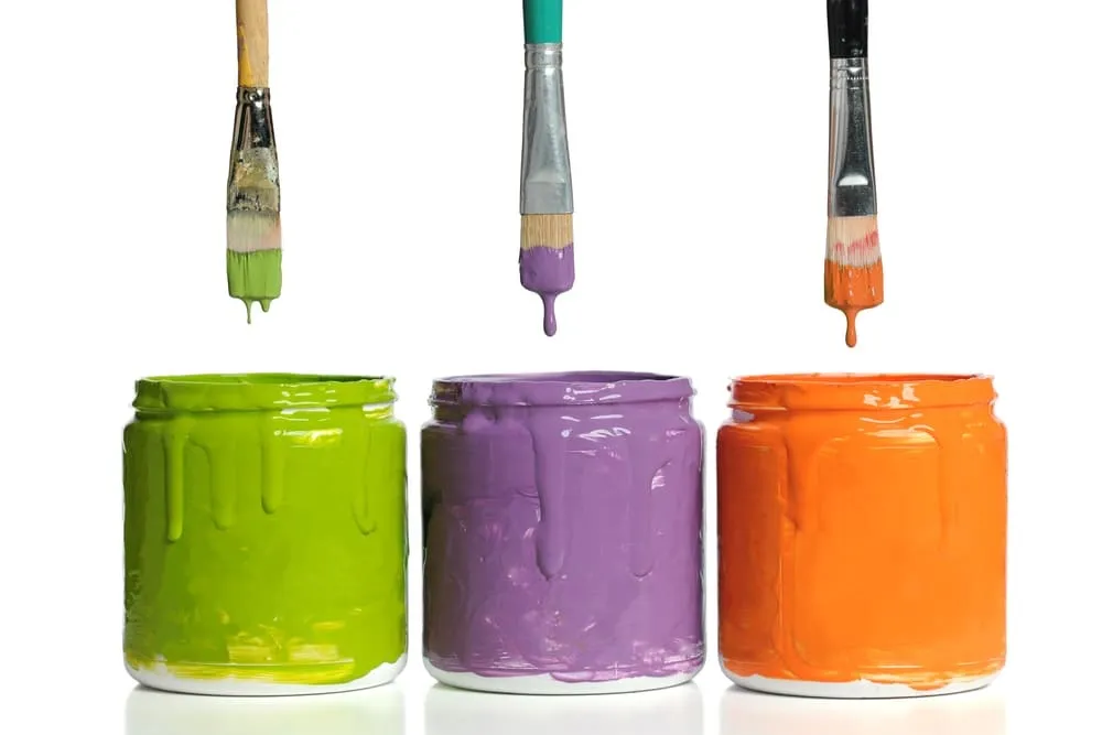 A secondary color results from combining two primary colors in a specified color model. The model matters because mixing light behaves differently from mixing paints or printing inks.
| Color model | Primary colors | Secondary colors | Typical use |
| RYB | Red, yellow, blue | Orange, green, purple or violet | Traditional art instruction and paint mixing |
| RGB | Red, green, blue | Yellow, cyan, magenta | Light mixing, screens, and digital images |
| CMY | Cyan, magenta, yellow | Red, green, blue | Ideal subtractive mixing |
| CMYK | Cyan, magenta, yellow, plus black | The same ideal secondary relationships as CMY | Color printing, with results affected by inks and paper |
Each three-primary model has three basic secondary combinations. However, the actual mixtures can produce many variations.
RYB is a useful introductory model, but it does not mean that red, yellow, and blue paints can reproduce every visible color. Likewise, screens and printers have limits to the colors they can reproduce.
Create Cinematic Colors and Professional-Looking Edits
How Are Secondary Colors Made?
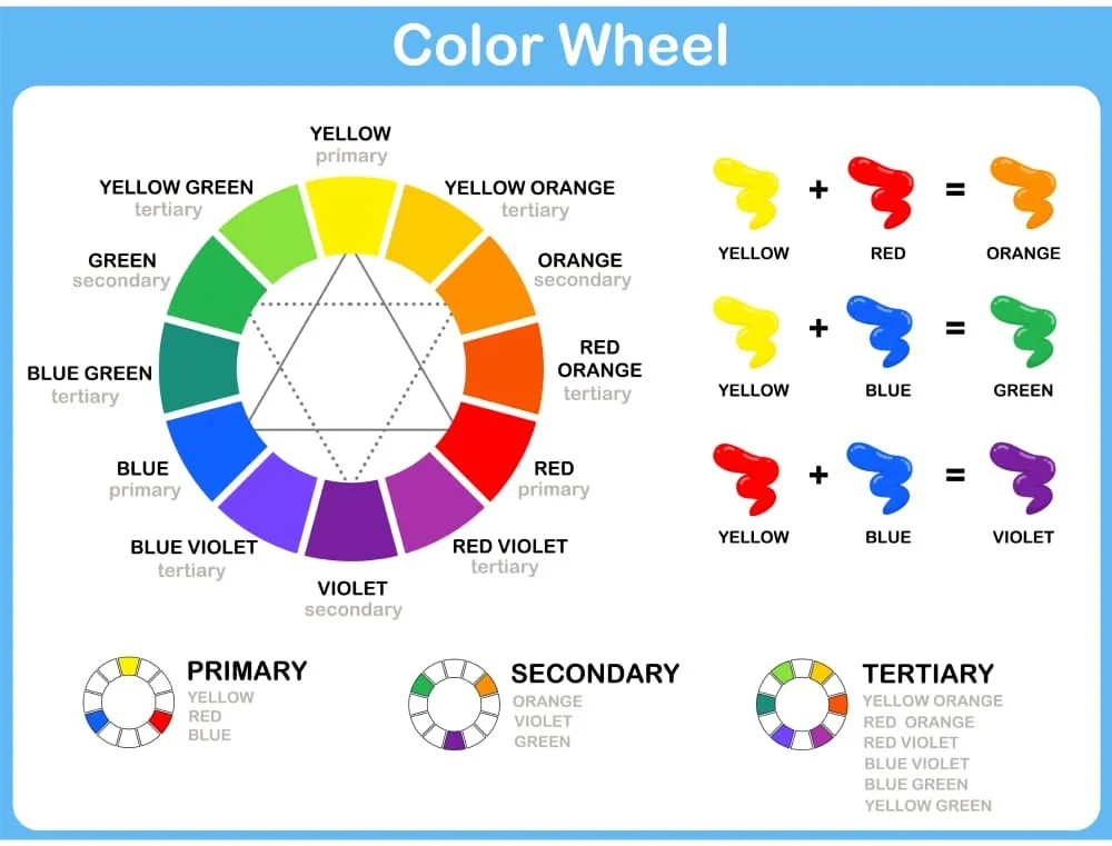
Secondary colors are made by combining primary colors according to the medium. Use the following relationships as starting points rather than expecting paint, light, and ink to behave identically.
Mixing Paint: The Traditional RYB Model
In traditional art instruction:
- Red + yellow = orange
- Yellow + blue = green
- Blue + red = purple
Actual paint mixtures depend on the pigments. A red that leans toward orange and a blue that leans toward green may produce a muted purple rather than a vivid one.
Start with small amounts and adjust gradually. A stronger pigment can dominate the mixture, so equal quantities are not always the best recipe.
Mixing Light: The RGB Model
Additive mixing combines light. At suitable intensities:
- Red + green light = yellow
- Green + blue light = cyan
- Blue + red light = magenta
Combining all three RGB primaries at equal full intensity produces white in the ideal model. This is why overlapping colored lights behave differently from overlapping paints.
Mixing Inks: The CMY and CMYK Models
Subtractive mixing works by absorbing portions of incoming light. In an ideal CMY model:
- Cyan + yellow = green
- Yellow + magenta = red
- Magenta + cyan = blue
Printing commonly adds black ink, creating CMYK. Real inks and paper affect the result, so printed colors may differ from their appearance on a screen.
Secondary Colors Examples in Everyday Life
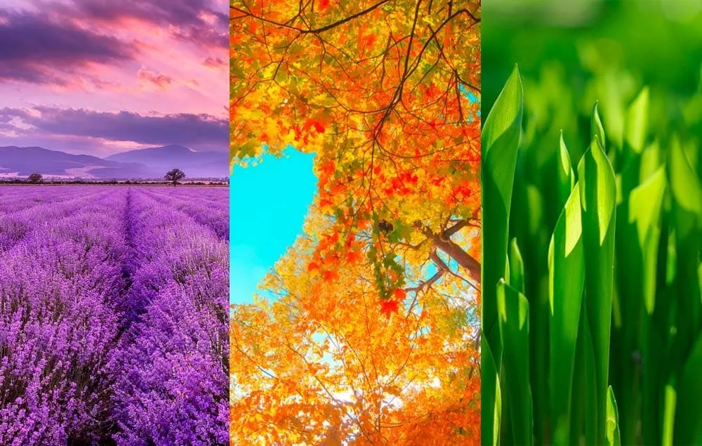
Orange, green, and purple are easy to recognize in familiar scenes. These examples illustrate the traditional RYB categories; an object does not need to have been physically mixed from paints to belong to one of them.
| Color | Everyday examples | Photography idea |
| Orange | Citrus fruit, pumpkins, autumn leaves | Photograph an orange subject against blue fabric or sky |
| Green | Leaves, grass, painted doors | Use foliage as a background and vary its brightness to separate the subject |
| Purple | Lavender, purple fabric, some grapes | Pair purple flowers with yellow details for a contrasting palette |
A clear palette works best when the subject remains easy to distinguish. Alongside hue, consider contrast in photography: differences in brightness and texture can separate objects that have similar colors.
How to Read a Secondary Color Wheel
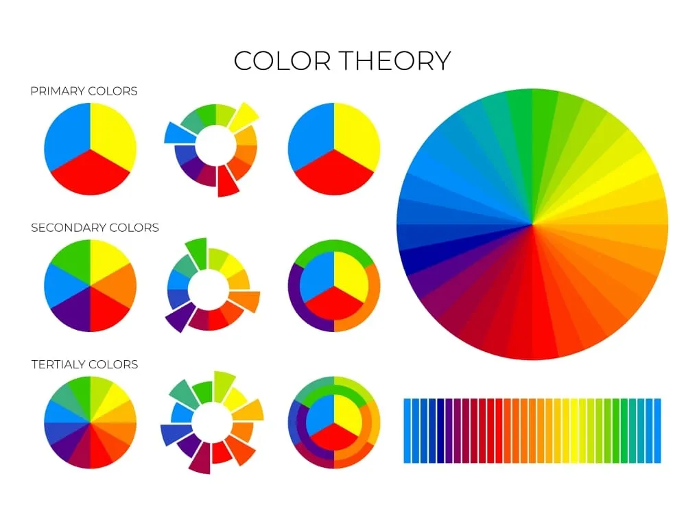
A color wheel places secondary colors between the primaries used to create them. A basic RYB wheel has six main positions; a common expanded wheel adds six intermediate, or tertiary, hues.
The wheel helps you choose relationships rather than prescribing a single correct palette.
Complementary Colors
Complementary colors sit opposite each other on the chosen wheel.
On a traditional RYB wheel, the pairs are:
- Orange and blue
- Green and red
- Purple and yellow
On an RGB/CMY wheel, the pairs are red and cyan, green and magenta, and blue and yellow.
Specify the model when discussing these relationships. An orange-blue pairing can be useful for a photographic composition, but it is not the same relationship as the additive RGB complement of blue, which is yellow.
Analogous Colors
Analogous colors sit next to one another on a color wheel. Examples on a traditional artist’s wheel include yellow, yellow-green, and green, or red, red-orange, and orange.
These palettes use nearby hues to create continuity. Our guide to analogous colors in photography explains how to coordinate them across a subject and its surroundings.
Tertiary Colors
In the traditional 12-part RYB wheel, tertiary colors sit between a primary and an adjacent secondary color. Examples include yellow-orange, red-purple, and blue-green.
Changing a color’s lightness or saturation creates further variations without necessarily changing its basic hue family.
Exclusive Tools of Endless Possibilities in One Editor
What Do Secondary Colors Mean?
Secondary colors can suggest ideas or moods, but they do not produce a fixed emotional response. Their effect depends on the image, the viewer’s associations, and how the colors are presented.
Orange: Warmth and Attention
Orange can suggest warmth through its association with fire, sunlight, and autumn. A bright orange object may attract attention, particularly against a contrasting background.
Muted terracotta and vivid orange communicate differently. Choose the version that suits the scene rather than assuming all orange feels energetic.
Green: Nature and Growth
 Green often suggests vegetation and growth. In a photograph, soft foliage may support a quiet atmosphere, while intense green lighting can create a very different impression.
Its association with nature does not guarantee relaxation or establish that a product is environmentally sustainable.
Purple: Imagination and Distinctiveness
 Purple may suggest fantasy, luxury, or spirituality in some contexts. Pale lavender, deep plum, and saturated violet can each contribute a different visual character.
Treat these associations as creative possibilities, not evidence that purple automatically increases creativity or curiosity.
How to Use Secondary Colors in Photography

Use secondary colors to give the frame a clear visual hierarchy. You do not need to include orange, green, and purple together.
Choose One Dominant Color
Start with a subject or setting that already contains a useful hue: orange leaves, green foliage, or purple flowers.
Then decide which elements should support it. A smaller area of a second color can act as an accent, while neutral surfaces give the palette room to breathe.
Coordinate the Subject and Background
For portraits, consider wardrobe alongside the location. Green clothing against foliage can create continuity, but differences in brightness are needed to keep the subject distinct.
For still life, move props or change the backdrop before editing. A deliberate arrangement often produces a clearer palette than trying to recolor every object afterward.
Use Light Deliberately
Colored lighting can introduce secondary hues through additive mixing. However, the result on a subject also depends on its surface color and reflectance.
Check a test frame before committing to a lighting setup. Keep a neutral-light reference when accurate product or skin color matters.
Your AI-Powered Photo Editor for MacOS and Windows
Refine Secondary Colors in Luminar
Luminar can help adjust an existing palette through its Color tool. These adjustments change image color values; they do not simulate physical paint mixing.

Adjust Hue, Saturation, and Luminance
In Luminar for desktop, open Color and use the HSL controls:
- Choose Hue to shift a selected color range toward a neighboring hue.
- Choose Saturation to strengthen or soften that range.
- Choose Luminance to make the selected range lighter or darker.
- Compare the edit with the original and check other objects sharing that color.

For example, reduce overly intense greens while keeping an orange subject prominent. Use small changes first, especially when orange adjustments also affect skin.
Keep Adjustments Local
When several objects share a hue, a global adjustment may affect all of them. Use the Color tool’s masking options to restrict the change to the intended area.
For instance, a local mask can help you adjust an orange jacket while protecting the wearer’s face.

Experiment With a Reference Palette
For creative work, a reference image can help you explore a different overall color treatment. Luminar’s Color Transfer tool offers a way to experiment with a reference image’s color style.

Review skin tones and recognizable objects afterward. For documentary or color-critical work, prioritize faithful color over a stylized treatment.
Conclusion
Secondary colors are easier to use when you first identify the model: RYB for traditional art instruction, RGB for light, and CMY/CMYK for subtractive mixing and print.
For your next photograph, choose one dominant hue and build a supporting palette around it. Refine the balance in Luminar when needed, while preserving the colors that matter to the subject.
Frequently Asked Questions
Green is secondary in the traditional RYB model and primary in RGB. In ideal CMY mixing, cyan and yellow produce green.
The answer depends on the color model.
No. Purple is a broad color term, while magenta names a particular red-blue color commonly used in RGB and CMY descriptions.
They should not be used interchangeably when explaining a color model.
The specific pigments may absorb too much of the light needed for a vivid purple. Their color bias and proportions affect the result.
Try different pigment combinations and test small quantities before mixing a larger batch.
No. Equal contributions are a useful simplified starting point, but actual paints differ in tinting strength.
Adjust the proportions to achieve the hue you want.
Yes. On a traditional RYB wheel, they form a triadic palette.
Give one color a dominant role and use the others more sparingly. Differences in brightness and saturation can help keep the composition readable.