Discover product photo background ideas, from white paper to textured surfaces, and learn how to create consistent images for your online store.
A good product photography background makes the item easy to see and helps the photograph fit its purpose. White paper can create a clean catalog image, textured stone can complement ceramics, and a familiar setting can show how a product fits into everyday life.
The choice involves more than color. Surface finish, lighting, product material, and framing all affect the result. A background that works for a matte skincare tube may create distracting reflections in a polished metal bottle.
This guide explains how to choose backdrops, work with different materials, and refine your product photos without changing the appearance of what you sell.
Don’t feel like reading the whole breakdown? We’ve pulled together a quick summary below.
Key Takeaways
- Choose the background according to the image’s purpose: catalog, campaign, social media, or lifestyle photography.
- White and gray provide flexible starting points, while colored and textured backgrounds need careful coordination with the product.
- Reflective and transparent objects require attention to everything around them, including surfaces outside the frame.
- Keep framing, lighting, and background treatment consistent across related product images.
- Background removal can help create variations, but edges, reflections, and contact shadows still need attention.
- For businesses processing large image collections, Luminar Engine can integrate photographic corrections into an existing production workflow.
What Makes a Good Product Photography Background?

A successful background helps viewers understand the product. Its outline should be visible, important details should remain clear, and surrounding elements should support the composition.
For a catalog photograph, that might mean a plain surface with enough contrast to reveal the item’s edges. For a campaign image, it might mean a more expressive color or material. A lifestyle photograph can include furniture, clothing, or other objects that explain how the product is used.
These images serve different purposes. A clean photograph helps customers inspect an item; a contextual photograph helps them understand its size, use, or relationship to other objects. A product gallery can benefit from both.
Before choosing a backdrop, answer three questions:
- Where will the photograph appear?
- Which product features need to be visible?
- Should the setting communicate anything beyond the item’s appearance?
These decisions also influence lighting and camera placement. Planning the complete product photography setup helps avoid choosing a background that becomes difficult to light or frame.
Make Your Products Stand Out with AI Photo Editing
Choosing a Background Color

Start with the product’s color, then consider how much separation it needs. Strong contrast makes an outline easier to see, while a similar background color creates a quieter composition that relies more heavily on lighting.
Color associations depend on context and audience. Blue does not automatically create trust, and black does not automatically make an item look expensive. The product, styling, typography, and overall presentation contribute to those impressions.
| Background | Useful for | What to watch |
| White | Clean catalog images and products with distinct outlines | Pale edges can disappear; excessive background lighting can wash out detail |
| Light gray | Neutral product galleries and lighter objects | Uneven lighting may create unwanted patches or gradients |
| Black or charcoal | Deliberate contrast and controlled highlights | Dark products need enough edge definition |
| Beige or muted earth tones | Ceramics, textiles, food, and restrained brand palettes | Warm surfaces may reflect color onto the product |
| Saturated colors | Campaigns, seasonal collections, and graphic compositions | Strong colors can compete with packaging or contaminate reflections |
| Gradients | Smooth tonal separation and more expressive compositions | Inconsistent gradients can make a catalog feel disjointed |
White Backgrounds
White is a practical starting point because it works with many product colors and leaves little visual distraction. It also makes photographs easier to combine with different page layouts.
However, a white backdrop does not automatically photograph as pure white. Its appearance depends on exposure and how much light reaches it. Increasing the exposure of the entire photograph to brighten the background may also remove detail from the product.
Separate background adjustments from product adjustments where possible. For a white item, a subtle shadow or slightly darker edge may be necessary to communicate its shape.
When preparing images for a marketplace, use that platform’s current image specifications to determine whether a pure white background is required.
Transform Your Images with an AI Background Changer
Gray and Neutral Backgrounds
Light gray provides a useful middle ground when white feels too stark and darker colors hide detail. It can give pale packaging more separation without adding a strong color to the scene.
Beige, cream, and muted brown can also work well, particularly when they complement the item’s materials. Check whether these surfaces reflect a warm tint onto white labels or polished areas.
Dark Backgrounds
Black and charcoal can emphasize controlled highlights on glass, metal, and glossy packaging. The challenge is keeping the product’s shape readable.
A dark bottle against a dark background may need a narrow highlight along one side. Move the light, reflector, or product until the outline becomes clear. Raising the exposure of the whole image may simply turn the background gray.
Colored Backgrounds
A colored backdrop can connect a photograph to a campaign or packaging palette. Choose a color that supports the item’s most important features.
For example, a pale blue background may separate orange packaging clearly. A similar orange background creates a more unified composition but requires stronger tonal separation.
Take a test photograph before committing to a full shoot. A background that looks appealing beside the product may behave differently once light reflects between the two surfaces.
Choosing Background Materials

Color determines only part of the look. Texture and finish influence reflections, shadows, and the amount of cleanup required.
| Material | Advantages | Limitations |
| Seamless paper | Smooth appearance; can curve from wall to tabletop without a visible corner | Marks, tears, and absorbs spills |
| Foam board or card | Affordable, lightweight, and convenient for small products | Limited size; edges and joins can appear |
| Vinyl | Often wipeable and reusable | Some finishes create glare or look artificial close up |
| Fabric | Adds folds, softness, and visible texture | Wrinkles, lint, and weave may become distracting |
| Wood, stone, or tile | Provides a physical surface with recognizable character | Can be heavy, reflective, or visually busy |
| Acrylic | Creates controlled reflections beneath a product | Shows fingerprints, dust, and scratches |
Seamless Paper for Clean Product Shots
A paper sweep curves behind and beneath the product, removing the sharp line where a tabletop meets a wall.
Use enough paper to fill the frame comfortably. A backdrop that barely fits can become a problem when photographing taller products or changing camera angles.
Keep the curve gradual and check that it does not crease. Small marks are often easier to avoid by replacing a damaged section than by retouching every photograph.
Fabric for Texture and Styling
Fabric can complement clothing, accessories, handmade goods, or homeware. Its folds can guide attention toward the product, but they should look intentional.
For a smooth appearance, prepare the fabric before shooting. For a textured composition, arrange a few controlled folds and remove lint. Fine patterns may also create distracting interference effects at certain camera distances.
Wood, Stone, and Other Textured Surfaces
Textured backgrounds work best when their scale suits the product. A large wood grain can overwhelm a small piece of jewelry, while a subtle stone surface may add enough variation without dominating the frame.
Avoid choosing a material solely because it looks attractive on its own. Place the product on it and check whether the surface helps reveal the item’s shape and finish.
Match the Background to the Product’s Surface

Some products can sit comfortably against almost any neutral background. Others reflect or transmit their surroundings, making the entire setup part of their appearance.
Reflective Products
Metal, glossy plastic, and polished packaging reflect more than the background visible behind them. They may also reflect the camera, windows, lights, and the photographer.
Use white or black cards outside the frame to shape those reflections. A broad white reflection can describe a curved surface; a narrow dark reflection can define an edge.
If the product looks uneven or cluttered, inspect its reflections before changing the backdrop.
Transparent Products
Glass and clear packaging require careful separation from the background. Lighting from behind or beside the object can help reveal its outline, depending on the desired look.
A digital background replacement is more complicated here because the original background may remain visible through the material. Removing the area around a glass bottle does not automatically replace what appears inside it.
For an important product image, capturing the object against the intended background can save considerable editing work.
Pale or Dark Products
White objects on white backgrounds and black objects on black backgrounds rely on controlled differences in brightness.
Use lighting to reveal edges, seams, and surface contours. The goal is to preserve the product’s actual appearance while making its shape understandable.
Products with Fine Edges
Fur, feathers, loose threads, and translucent fabric can be difficult to separate cleanly in editing. Choose a background that provides useful contrast without casting a strong color onto those edges.
Inspect a close-up test frame before photographing an entire collection.
Lighting the Background

A backdrop can appear lighter, darker, or more textured depending on how it is lit.
Light directed across a surface emphasizes texture. More frontal illumination tends to reduce the appearance of small surface irregularities. Moving the product farther from a vertical backdrop can give you more control over shadows and background illumination.
Even lighting is useful for a clean catalog image, but it is not mandatory for every photograph. A deliberate gradient or directional shadow can support a campaign composition.
Pay particular attention to three areas:
- Product edges: Are they distinct without looking unnaturally outlined?
- Contact shadow: Does the item appear to rest on the surface?
- Reflections and color spill: Has the backdrop changed the appearance of the product?
A shadow is not automatically a flaw. A restrained contact shadow can communicate shape and keep an object from appearing to float.
Using Backgrounds to Show Products in Context

A contextual background should explain something useful about the product.
A travel mug beside a laptop can suggest a workday routine. A backpack photographed on a walking route can show how it sits on the wearer. A table lamp in a room can demonstrate scale and how its light interacts with nearby surfaces.
Keep props relevant and make the featured product easy to identify. Avoid filling the frame with attractive objects that compete for attention.
The principles of lifestyle product photography are particularly useful when planning these images: the setting and action should help viewers understand the item.
Refining Product Backgrounds in Luminar
Editing can improve a well-planned setup by correcting uneven tones, cleaning temporary distractions, or preparing an alternative background.
Start with the photograph as a whole. Balance exposure and white balance before making selective changes. Then inspect the backdrop separately from the product.

Correct Background Color Selectively
Use photo color editing tools to refine the backdrop while protecting the item’s appearance. Masking is useful when a global adjustment would also change packaging, fabric, or labels.
Keep an eye on reflected color. Neutralizing a background does not necessarily remove the tint it has cast onto a glossy product.

Remove or Replace a Background
Luminar’s Background Removal AI can create an initial cutout, with a Refinement Brush available for correcting the selection. In the desktop editor:
- Open the image in Edit.
- Go to Layer Properties > Masking > Background Removal AI.
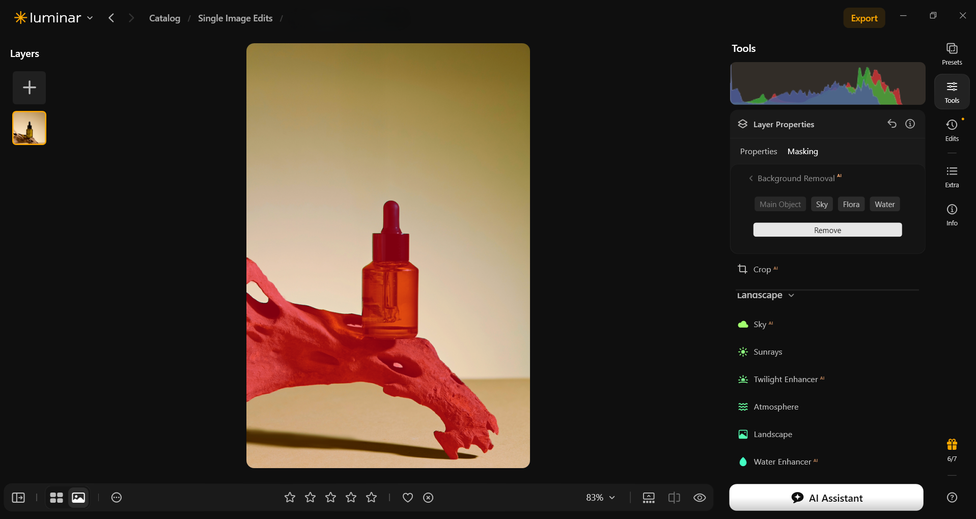
- Select the object or elements to retain.
- Choose Remove.
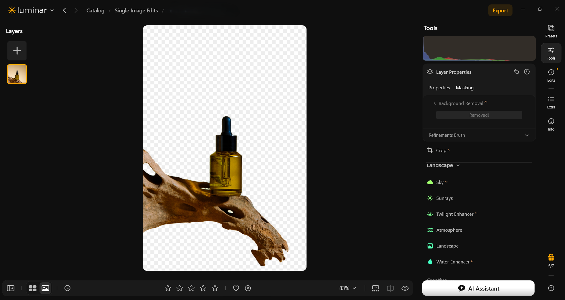
- Refine the object, background, and transition areas where needed.
- Add a new background as a layer beneath the product.
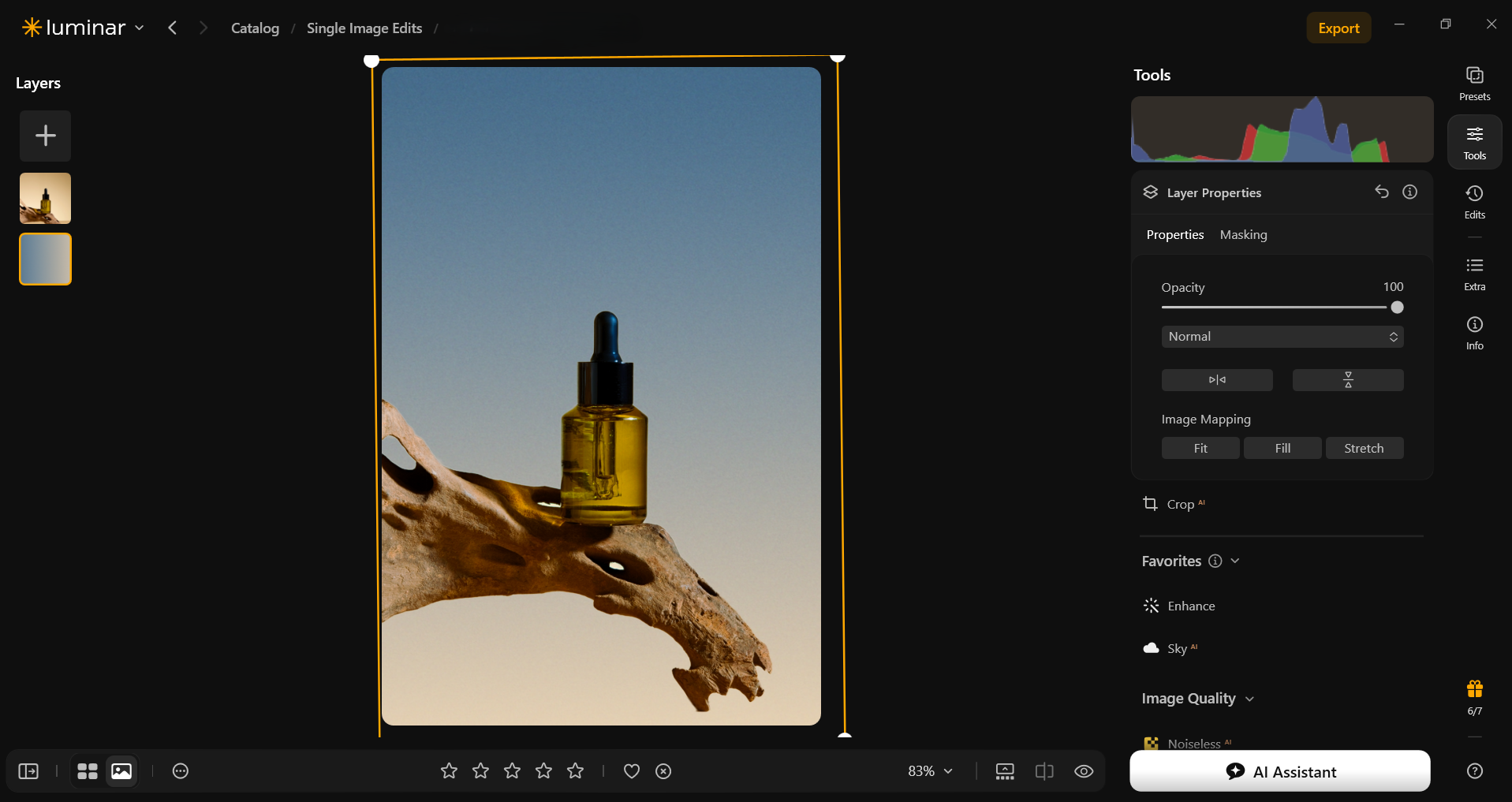


After using AI background removal, inspect handles, gaps, fine fibers, and curved edges at a close zoom. Then view the complete image to assess whether the result feels coherent.
The replacement background should suit the original camera angle and lighting. A product photographed from above will not sit convincingly on a surface viewed from a low angle.
Retain or rebuild an appropriate contact shadow when the composition needs one. Clean edges alone are not enough to make a replacement look natural.
Elevate Your Photography with Our Advanced Software
Keeping Backgrounds Consistent Across a Catalog
Consistency comes from repeatable capture decisions as well as editing.
Create a short reference sheet for each product category. Record the background, camera position, lighting arrangement, crop, and approximate product size within the frame. Keep an approved photograph available as a visual reference.
For related items, compare images side by side. Check whether:
- Background brightness remains consistent.
- Products occupy a similar amount of space.
- Shadows follow the same general direction.
- Cropping and alignment feel deliberate.
- Color adjustments preserve differences between product variants.
Identical settings will not always produce identical results. A reflective bottle and a matte box interact with light differently, even when placed in the same position. Use shared settings as a starting point, then refine individual photographs.
Supporting Larger Product Workflows with Luminar Engine
For an ecommerce team handling recurring product shoots, background consistency is part of a broader production process. Files must be developed and corrected before retouchers prepare cutouts, campaign variations, or final catalog images.
Luminar Engine lets businesses integrate Skylum’s image-processing technology into their own software and automated workflows. Its base operations include RAW conversion, lens and perspective correction, and exposure adjustment. Processing runs on the company’s own servers, keeping images within its network. It requires technical integration rather than operating as an interactive photo editor.

A product studio could use it to prepare incoming captures before sending them to its background-editing and review stages. The surrounding business system would handle product identifiers, file routing, and approval.
For this workflow, the value is a repeatable preparation stage. Art direction, difficult transparent edges, and accurate product colors still need their own review.
Choose a Background That Helps Explain the Product
The strongest product background makes the item easier to understand. Sometimes that means a plain white sweep; sometimes it means a textured surface or a setting that demonstrates use.
Start with the image’s purpose, test the background under the intended lighting, and inspect how it interacts with the product’s material. A repeatable setup gives you a stronger foundation for editing and makes future shoots easier to match.
FAQ
The best background depends on the product and where the photograph will appear. White and light gray are flexible choices for catalog images. Colored, textured, and contextual backgrounds can work well for campaigns and supporting gallery images.
No. White minimizes distraction, but a colored background can provide better separation or support a campaign palette. The important question is whether the background helps viewers see the product clearly and suits the intended use.
Large sheets of paper, foam board, plain card, fabric, and existing tabletops can work. Choose a surface large enough to fill the frame and check for wrinkles, visible joins, glare, or patterns that compete with the product.
Yes. Background removal and layers can help place a product against a different color or scene. Fine edges, transparent materials, reflections, and shadows may need additional work to make the result convincing.
Related catalog images benefit from a consistent approach, but different categories or campaigns can use different backgrounds. Keep a clear system so the variations feel intentional and customers can still compare products easily.