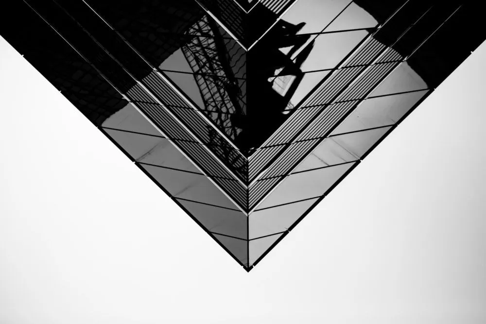
The elements of art are the visual building blocks of a photograph. Understanding line, shape, form, texture, color, space, and value helps you create stronger compositions and communicate ideas more intentionally.
Have you ever looked at a photograph and wondered why one image immediately catches your attention while another feels ordinary? Often, the difference comes down to how the photographer uses the basic elements of visual art.
Lines, shapes, forms, textures, colors, space, and light are the building blocks of photography. On their own, they may seem simple. Combined thoughtfully, they can guide the viewer’s eye, create depth, establish a mood, and help communicate a story.
Understanding these elements won’t make every photograph automatically better, but it will give you more control over what you put inside the frame and how viewers experience it.
Don’t feel like reading the whole breakdown? We’ve pulled together a quick summary below.
Key Takeaways
Lines can guide the viewer’s eye and create movement or structure.
Shapes help organize a frame and make subjects visually recognizable.
Form gives subjects a sense of three-dimensionality through light and shadow.
Texture makes photographs feel more tactile and detailed.
Color can influence mood, contrast, and visual hierarchy.
Space determines how crowded, balanced, or open an image feels.
Light and value help define depth, shape, and atmosphere.
The strongest photographs often combine several visual elements rather than relying on just one.
The Main Elements of Art in Photography
There are several ways to classify the elements of visual art, but photography commonly relies on seven fundamental ones:
Line
Shape
Form
Texture
Color
Space
Value
Let’s look at each one and see how you can use it in your own photographs.
Exclusive Tools of Endless Possibilities in One Editor
Lines are everywhere in photography. Roads, buildings, fences, tree branches, shadows, horizons, and even the position of a person’s body can create lines.
Lines can be horizontal, vertical, diagonal, curved, or irregular. Each type can influence the way we perceive an image.
Horizontal lines often suggest stability and calm.
Vertical lines can communicate height, strength, or structure.
Diagonal lines create movement and energy.
Curved lines can feel softer and lead the eye gradually through the frame.
Converging lines can direct attention toward a particular point.
One of the easiest ways to practice with lines is to photograph a road, staircase, bridge, or corridor. Position yourself so that the lines lead toward your main subject.
Lines don’t always have to be physical objects, either. A row of people, a trail of footprints, or a series of lights can create an implied line.
2. Shape: Simplifying the Scene
Shapes are two-dimensional areas defined by edges, contrast, or changes in color.
Circles, squares, triangles, and rectangles are geometric shapes. Organic shapes include leaves, clouds, rocks, and the outlines of people or animals.
Photography can become especially interesting when you simplify a scene into a collection of shapes.
For example, a person standing in front of a bright window can become a dark silhouette. Instead of seeing every detail of the person, the viewer primarily sees their outline.
Look for strong shapes when photographing architecture, street scenes, silhouettes, and minimalist compositions.
3. Form: Creating a Sense of Depth
Shape is flat; form suggests volume.
In photography, form is created largely through the interaction of light and shadow. A round object photographed with even, flat lighting may look like a simple circle. Add directional light and gradually changing shadows, and it begins to appear three-dimensional.
This is why the direction of light matters so much.
Side lighting can reveal the contours of a face, the folds of fabric, or the surface of a piece of fruit. Backlighting can emphasize an outline, while front lighting tends to reduce visible texture and depth.
When photographing objects, try moving the light around the subject rather than changing the subject itself. Notice how its apparent form changes.
4. Texture: Making Images Feel Tactile
Texture describes the visible surface quality of a subject.
The rough surface of tree bark, wrinkles in fabric, the crust of freshly baked bread, or droplets of water can all provide strong visual texture.
Texture becomes particularly noticeable when light comes from an angle. Low, directional light creates small shadows across an uneven surface, making details easier to see.
Try photographing textures up close. Then experiment with different lighting directions and compare the results.
Texture can also become the main subject of a photograph rather than simply supporting another subject.
5. Color: Creating Mood and Contrast
Color is one of the most immediately noticeable elements in photography. It can establish a mood, separate subjects, create visual relationships, or direct attention to a particular part of the frame.
Warm colors such as red, orange, and yellow can feel energetic or inviting, while cooler blues and greens can create a quieter atmosphere. These associations aren’t universal, but they can influence how an image is perceived.
Color relationships are also useful for composition.
Complementary colors sit opposite each other on the color wheel and can create strong contrast. Analogous colors sit close together and tend to produce a more harmonious appearance. A monochromatic image can use different shades of the same color for a restrained visual effect.
You don’t have to find perfect color combinations every time. Start by noticing them.
Before taking a photograph, ask yourself:
What is the dominant color?
Is there a contrasting color that attracts attention?
Space describes the areas occupied by subjects and the areas around them.
One particularly useful concept is negative space — relatively empty areas surrounding the main subject.
Negative space can make a photograph feel calm, minimal, isolated, or spacious. It can also make a small subject appear more significant.
For example, a person standing against a large, uncluttered wall creates a very different impression from a person surrounded by dozens of objects.
Space can also communicate direction. When a person, animal, or moving object faces toward one side of the frame, leaving more space in front of them can create a natural sense of movement.
Don’t assume that every part of a photograph needs to be filled. Empty space is still part of the composition.
7. Value: Working With Light and Dark
In visual art, value refers to how light or dark an area appears.
In photography, value is closely connected to light, shadow, contrast, and exposure.
A photograph containing mostly bright tones can feel very different from one dominated by deep shadows.
High-key images generally contain predominantly light tones and relatively low contrast. Low-key images rely more heavily on dark tones and stronger shadows. Neither approach is inherently better — they simply create different visual effects.
Value is also essential for showing form. Gradual transitions between light and dark can make objects appear three-dimensional, while strong contrast can separate a subject from its surroundings.
Black-and-white photography makes value especially easy to study because color is removed from the equation. When looking at a monochrome image, pay attention to where the brightest and darkest areas are and how your eye moves between them.
How the Elements Work Together
The seven elements rarely appear independently.
Imagine a portrait taken beside a window. The line of the window frame can direct attention toward the person. The person’s silhouette creates a shape, while directional light gives their face form. Their clothing adds texture, the colors establish a mood, the surrounding wall provides space, and the contrast between the illuminated and shadowed areas creates value.
One photograph can therefore use several visual elements at the same time.
This is one of the most useful things to understand as a beginner: you don’t need to deliberately include every element in every photograph. Instead, learn to recognize which elements are already present and decide which ones deserve the viewer’s attention.
Composition Principles vs. Elements of Art
It’s easy to confuse the elements of art with composition principles.
The elements are the visual building blocks: line, shape, form, texture, color, space, and value.
Composition principles describe ways of arranging or using those building blocks. Examples include balance, contrast, rhythm, repetition, emphasis, proportion, and movement.
For example, color is an element. Using a small area of bright red against a mostly neutral scene can create emphasis — a composition principle.
Understanding both concepts gives you a more practical way to analyze photographs.
Using the Elements While Taking Photos
You don’t need to turn photography into a complicated checklist. Instead, try asking yourself a few questions before pressing the shutter:
What catches my eye first? This can help you identify the main subject and visual emphasis.
Where do the lines lead? Check roads, buildings, shadows, and other directional elements.
Is the frame too crowded? Look for unnecessary objects and consider using negative space.
Where is the light coming from? Observe how it affects form, texture, and value.
Are the colors helping the subject? If several bright colors compete for attention, simplifying the scene may help.
What can I remove from the composition? Sometimes the best improvement is simply eliminating a distracting element.
Your AI-Powered Photo Editor for MacOS and Windows
The elements of art are primarily created during the shoot, but editing can help refine them.
For example, you might slightly adjust contrast to make a subject stand out, fine-tune color relationships, or crop the frame to give a composition more breathing room.
In Luminar, you can work with exposure, contrast, color, and other adjustments while refining your photographs.
Tools such as Studio Light can also give you additional control over lighting in compatible portrait images.
Editing can also help remove visual distractions that compete with the main subject. For example, GenErase can be used to remove unwanted objects from an image.
The important thing is to use editing to support the visual idea you already have rather than trying to rebuild the entire composition afterward.
A Simple Exercise: Find the Elements Around You
You don’t need an exotic location to practice.
Take a walk around your neighborhood and photograph the same subject in several different ways:
Find a strong line, such as a road or fence.
Look for a simple shape, such as a window or doorway.
Find a textured surface and photograph it close up.
Photograph the same scene in different light to study value and form.
Look for two or three colors that work together.
Make one photograph with lots of negative space.
Make another version with a much tighter composition.
Then compare the photographs.
You may discover that changing your position, light, or framing has a greater effect than changing the subject itself.
Common Mistakes When Using the Elements of Art
Mistake
Why it can be a problem
What to try
Adding too many visual elements
The image can feel chaotic
Simplify the frame
Ignoring the background
Distracting shapes or lines compete with the subject
Check the edges before shooting
Using color without considering contrast
Important subjects can get lost
Look for color relationships
Flattening all shadows in editing
Form and texture can disappear
Keep some natural tonal variation
Filling every part of the frame
The image may feel crowded
Experiment with negative space
Looking only at the subject
Composition is more than the main object
Check the whole frame
Final Thoughts
The elements of art in photography aren’t rules that every photograph has to follow. They’re a vocabulary for understanding why an image works.
Start by noticing lines. Then pay attention to shapes, texture, color, space, and the relationship between light and shadow. Eventually, you’ll begin seeing these elements before you even raise your camera.
The most interesting part is that the same subject can look completely different when you change just one element. Move the camera, wait for different light, simplify the colors, or give the subject more space — and you can tell an entirely different visual story.
So next time you take a photograph, don’t just ask, “Is this a good subject?” Ask, “What visual elements are making me look at it?”
That question can change the way you photograph.
FAQ
What are the elements of art in photography?
The commonly discussed elements are line, shape, form, texture, color, space, and value. They are the basic visual components photographers use to build an image.
Why are elements of art important in photography?
They help photographers understand how visual details affect composition, depth, mood, and the viewer’s attention.
What is the difference between shape and form in photography?
Shape is essentially two-dimensional, while form suggests three-dimensional volume. Lighting and shadows are important for creating a sense of form.
Is color an element of photography?
Yes. Color can influence mood, create contrast, establish visual relationships, and direct attention within a photograph.
How can I practice the elements of art in photography?
Choose one element at a time and photograph it intentionally. For example, spend one photo walk looking specifically for lines, then another looking for texture or negative space.
Subscribe to know first
Our delivery owl will bring you our best deals and news about Skylum news.