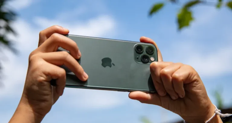
Neon colors are intense, highly saturated hues associated with fluorescent pigments, illuminated signs, fashion, digital art, and modern visual design. Electric blue, hot pink, fluorescent green, and bright yellow can create strong contrast and immediately draw attention to a subject.
In photography, neon colors can work especially well in portraits, night street scenes, product photography, and creative compositions. The key is to balance saturated colors with darker or more neutral tones so the image remains easy to read. You can also refine color, contrast, and glow effects during post-processing with an image color editor.
Don’t feel like reading the whole breakdown? We’ve pulled together a quick summary below.
Key Takeaways
- Neon colors are extremely bright and saturated hues commonly associated with fluorescent materials and illuminated signs.
- Neon photography works particularly well with dark or neutral backgrounds that provide strong contrast.
- Complementary colors such as cyan and pink or blue and orange can create striking visual contrast.
- A monochromatic neon palette can create a strong, cohesive look when variations in brightness and saturation provide enough separation.
- Natural light, practical neon signs, LED lighting, and colored gels can all introduce neon-like colors into photographs.
- Highly saturated colors can lose detail when highlights are clipped, so check exposure when photographing bright signs and lights.
- During editing, adjust saturation selectively rather than increasing it across the entire image.
- Luminar can help refine color, contrast, and creative neon effects after the photograph has been captured.
What Are Neon Colors?
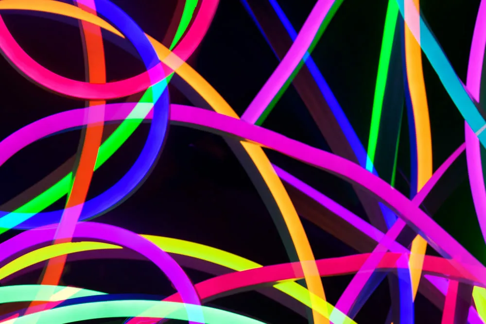 Neon colors are exceptionally bright, saturated hues that appear unusually vivid and luminous. The term is commonly used for colors such as fluorescent pink, electric blue, lime green, and bright yellow.
Strictly speaking, “neon color” is not a scientific category of visible light. The appearance can come from fluorescent pigments and dyes, which absorb some wavelengths of light and emit part of that energy at longer wavelengths, or from actual illuminated sources such as neon signs and LEDs.
The name comes from the noble gas neon. When an electric current passes through neon gas in a discharge tube, it produces a characteristic reddish-orange light. Over time, the word “neon” became a broader design and color term for intensely vivid hues, even when those colors are produced by other pigments or lighting technologies.
In photography, this distinction matters. A brightly colored object and an actual light source may produce very different results. A neon sign can create colored illumination on nearby surfaces, while a fluorescent-colored object may simply reflect available light.
Neon Lights Photography: Illuminate Your Creativity
Learn moreHow to Use Neon Colors in Photography
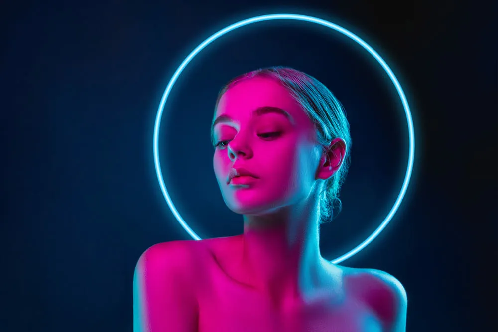 Neon colors can become the visual focal point of a photograph, but they work best when the rest of the composition supports them. Before shooting, consider the relationship between the brightest color, the background, and the subject.
1. Use Complementary Colors for Contrast
Complementary colors sit opposite each other on a traditional color wheel. Pairing contrasting hues can make both colors appear more prominent.
Common combinations include cyan and red-orange, blue and orange, and violet and yellow. You do not need to use both colors at maximum saturation. A bright neon accent against a more subdued complementary background can often produce a cleaner composition.
When editing, selective color adjustments can help maintain this contrast without making every color in the photograph equally intense.
2. Try a Monochromatic Neon Palette
A monochromatic color scheme uses variations of a single hue rather than several unrelated colors. With neon photography, this could mean combining different shades of cyan, pink, violet, or green.
To prevent a monochromatic image from looking flat, vary brightness, saturation, texture, and composition. A dark background with several intensities of the same neon hue can create depth while keeping the color palette consistent.
3. Pair Neon with Dark or Neutral Backgrounds
Dark surroundings provide natural contrast for illuminated signs and brightly colored subjects. Night streets, dark interiors, concrete surfaces, and black or gray backgrounds can all help neon elements become the visual focus.
For creative editing, Luminar’s Neon & Glow tools can add or enhance glowing elements. Because this type of effect changes the appearance of the original scene, it is best suited to creative and conceptual photography rather than documentary work.
4. Look for Neon Color Palettes in Real Scenes
You do not need to build an elaborate set to photograph neon colors. Look for combinations in everyday environments: illuminated storefronts, signs, arcades, nightlife, colored walls, fashion, vehicles, and reflections after rain.
When photographing a neon sign, pay attention to how its light affects nearby people and surfaces. Reflections in windows and wet pavement can introduce additional color without adding another physical light source.
Creative Approaches to Photographing Neon Signs
Learn moreNeon Color Palettes for Photography
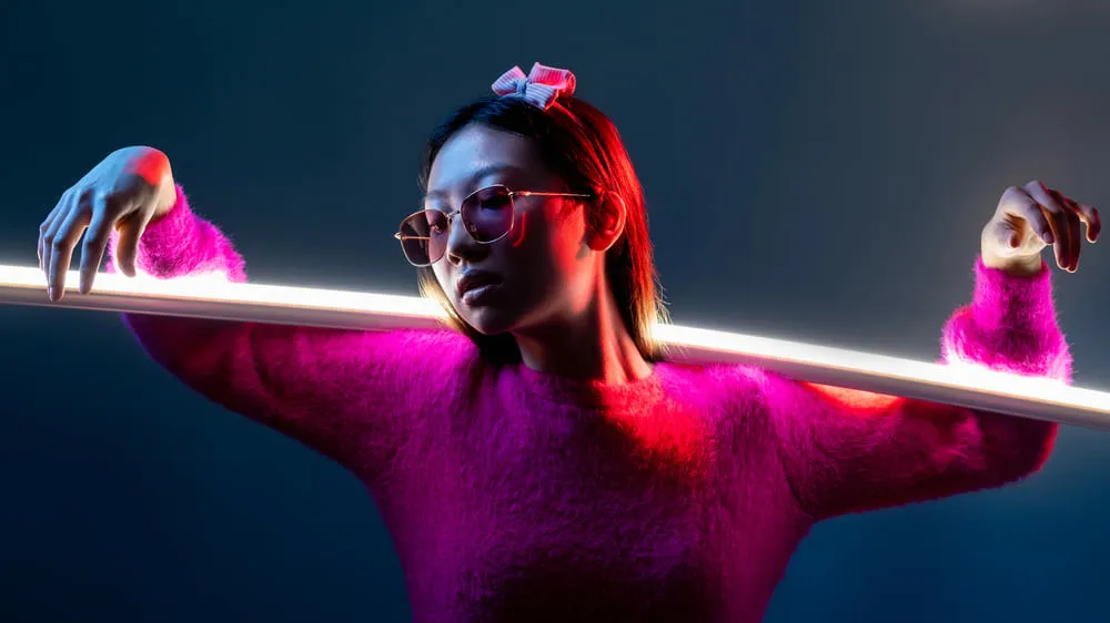 Different combinations of neon hues can create very different moods. Instead of treating color palettes as fixed formulas, use them as starting points for choosing subjects, backgrounds, and lighting.
| Palette | Example Colors | Best Suited To |
| Electric Sunset | Neon pink, orange, yellow, magenta, lavender | Fashion, portraits, colorful sunsets, creative advertising |
| Cyberpunk | Cyan, hot pink, electric blue, lime green, violet | Night streets, portraits, futuristic digital art |
| Tropical | Coral, turquoise, lime, purple, yellow | Travel, summer portraits, lifestyle and product photography |
| Neon Night | Deep purple, electric blue, neon green, orange, white | Urban photography, nightlife, architecture |
| Retrowave | Teal, bright pink, yellow, violet, red | Retro portraits, cars, music-inspired and conceptual photography |
1. Electric Sunset
This warm-and-cool combination uses pink, orange, yellow, magenta, and lavender. The palette can work well for portraits, fashion images, and creative scenes where you want a playful, energetic atmosphere.
Example colors: Neon Pink (#FF6EC7), Tangerine Orange (#FF8C42), Bright Yellow (#FFD700), Vivid Magenta (#FF00FF), Cool Lavender (#CDA2FF)
2. Cyberpunk
Cyan, pink, blue, green, and violet are strongly associated with futuristic and cyberpunk-inspired imagery. Use one or two dominant colors and let the remaining hues act as accents rather than giving every color equal visual weight.
Example colors: Neon Cyan (#00FFFF), Hot Pink (#FF1493), Electric Blue (#7DF9FF), Lime Green (#32CD32), Ultra Violet (#6A0DAD)
3. Tropical
Turquoise, coral, lime, purple, and yellow can create a bright, summery palette. These colors are useful for lifestyle photography, colorful products, fashion, and outdoor scenes.
Example colors: Neon Coral (#FF6F61), Bright Turquoise (#00CED1), Fluorescent Lime (#CCFF00), Vivid Purple (#8A2BE2), Sunshine Yellow (#FFD300)
4. Neon Night
Deep blue and purple can provide a darker foundation for brighter green, orange, or white accents. This approach is particularly effective for city streets and nighttime architecture, where illuminated details contrast with surrounding shadows.
Example colors: Deep Purple (#9400D3), Electric Blue (#0000FF), Neon Green (#39FF14), Vibrant Orange (#FFA500), Bright White (#FFFFFF)
5. Retrowave
Bright cyan, pink, yellow, violet, and red can evoke the visual language of 1980s-inspired synthwave and retrowave design. Try combining these colors with geometric shapes, cars, architecture, or nighttime scenes for a deliberately stylized look.
Example colors: Neon Teal (#00F0FF), Bright Pink (#FF007F), Neon Yellow (#FFFF00), Electric Violet (#8F00FF), Neon Red (#FF073A)
Why Use a Neon Color Palette?
Color affects how viewers interpret a photograph. Highly saturated neon hues can suggest energy, nightlife, technology, youth, or a deliberately artificial aesthetic. They can also direct attention toward a particular subject or area of the frame.
However, more saturation does not automatically make a better photograph. If every part of the image is equally bright and colorful, there may be no clear focal point. A more effective approach is often to reserve the strongest color for the subject and keep secondary elements darker or less saturated.
| Pros | Cons |
| Creates strong visual contrast | Can become distracting when too many saturated colors compete |
| Works well for night and urban photography | Bright signs and lights can be difficult to expose correctly |
| Can establish a distinctive visual mood | Heavy editing can make skin tones and other natural colors look unrealistic |
| Useful for creative and conceptual photography | Added digital glow can make an image look artificial if overused |
How to Photograph Neon Lights
Neon photography presents a few technical challenges because illuminated signs and LED sources can be much brighter than their surroundings. A few simple adjustments can help preserve detail and color.
Watch the Exposure
Bright signs can contain small areas that are much brighter than the rest of the scene. Check the highlights and reduce exposure if necessary. Protecting highlight detail is particularly important when the sign itself is an important part of the composition.
Use the Environment
Look beyond the light source itself. Reflections on wet pavement, glass, metal, and painted surfaces can extend the color through the frame. People standing near a sign can also pick up colored light, creating an additional connection between the subject and the environment.
Choose a Strong Focal Point
A neon sign does not have to be the main subject. It can frame a person, create a leading line, provide a background accent, or add color to an otherwise restrained composition.
Keep White Balance in Mind
Different artificial light sources can produce strong color casts. If you are photographing RAW files, you have more flexibility to adjust white balance later. For JPEG images, try to establish an appropriate white balance while shooting so that skin tones and neutral surfaces remain believable.
Editing Neon Photography with Luminar
Post-processing can help balance intense colors while preserving the atmosphere of the original photograph. Luminar provides tools for adjusting color, contrast, saturation, and other aspects of an image without requiring you to push every color equally.
Start with basic corrections such as exposure, white balance, and contrast. Then refine the neon colors selectively. Adjusting saturation and vibrance can strengthen muted colors, while targeted color adjustments can help control hues that have become too dominant.
Luminar’s color editing tools can help correct unwanted color casts and refine the overall color balance. For example, you might reduce an excessive green cast in skin tones while preserving the cyan and magenta lighting that gives a night portrait its character.
For creative projects, the Neon & Glow tool can introduce neon and glow effects into an image. You can apply the effect selectively rather than covering the entire frame, making it easier to keep the subject recognizable and the composition controlled.
When using digital neon effects, compare the edited image with the original regularly. The goal is not necessarily to maximize brightness or saturation, but to make the effect support the subject and visual idea.
Your AI-Powered Photo Editor for MacOS and Windows
How to Keep Neon Colors Looking Natural
Neon photography is often intentionally stylized, but controlled editing can prevent the image from becoming visually overwhelming.
- Protect highlights: Avoid clipping important illuminated details.
- Limit the strongest colors: Give one or two hues visual priority.
- Watch skin tones: Colored light can strongly affect faces, so correct skin selectively when needed.
- Use contrast: Dark areas can give highly saturated colors room to stand out.
- Be careful with glow: A subtle glow can suggest light, while excessive glow can obscure texture and detail.
- Compare before and after: Make sure editing enhances the original idea rather than replacing it.
Conclusion
Neon colors can give photographs a strong visual identity when they are used deliberately. Start by choosing a clear color relationship, such as a complementary or monochromatic palette, then use darker or neutral elements to create contrast. When photographing real neon lights, pay particular attention to exposure, reflections, and white balance.
During editing, make selective color adjustments rather than simply increasing saturation across the entire image. For more experimental work, Luminar can help refine the color palette or introduce controlled Neon & Glow effects while keeping the original composition in focus.
Frequently Asked Questions
Neon colors are extremely bright and saturated hues commonly associated with fluorescent pigments, dyes, illuminated signs, and vivid digital design.
Common examples include fluorescent pink, electric blue, neon green, bright yellow, vivid orange, cyan, and intense violet.
Neon colors create strong visual contrast and can quickly establish a focal point, particularly against dark or neutral backgrounds.
Meter carefully for bright signs, protect highlight detail, and use reflections, surrounding architecture, and people to build a stronger composition.
Yes. Photo-editing software can enhance existing neon lighting or add creative neon and glow effects. Luminar includes a dedicated Neon & Glow tool for this purpose.