Why do some photos feel perfectly balanced without being symmetrical? Photographer Steve Roe explains how informal balance and visual weight can transform your compositions.
Most beginners think balance means symmetry in photography. Photos that look like stills from a Wes Anderson film, with everything equally proportioned and perfectly mirrored. Surely that’s the only way to achieve balance in photography?
Well, many great photographs feel perfectly balanced without ticking any of those boxes. Experienced photographers don’t create balance through equal sides, they create it through equal visual weight. While that term may sound vague, it’s actually a surprisingly simple concept to understand, and once you do, you’ll start seeing opportunities for it everywhere. Let’s get started.
What is Informal Balance?

Let’s first look at what formal balance is. That’s when we have visual symmetry in our image, such as a subject standing in the centre with equally sized trees on either side.
Informal balance is the complete opposite. Imagine a huge mountain dominating one side of your image and a tiny person standing on the other. The mountain completely dominates the frame, so naturally you would expect all of your attention to go there.
Yet somehow, the image can still feel perfectly balanced, and that’s where visual weight comes in.
Although your subject may be tiny, they can actually compete for attention just as much as, or even more than, the mountain itself. Let’s see how.
Exclusive Tools of Endless Possibilities in One Editor
Visual Weight
So let’s look at what creates visual weight, allowing a small figure to demand just as much attention as something colossal in scale.
There are numerous ways to do this, but bright colours are one of the strongest. Bright colours carry a huge amount of visual weight and immediately attract the viewer’s eye. Suddenly, the enormous mountain, building, or bridge dominating most of the frame becomes the second thing the viewer notices.
The same applies to bright light and high contrast. If the larger object in your frame is darker, it naturally recedes, while brighter colours, illuminated areas, and stronger contrast advance. These are the elements our brains instinctively recognise first.
When it comes to colour, however, there is a small caveat. There’s something called colour weight, which is an important principle in colour theory. Warm colours naturally advance while cooler colours tend to recede.
So if your larger object is red while your subject contains cooler colours, you’ll find it much harder to achieve informal balance.
Thankfully, colour isn’t the only way to create visual weight. People’s faces and animals naturally attract attention too. It’s almost as though they carry psychological weight because our brains are hardwired to recognise faces. Knowing this, you can use it to your advantage. Portrait photographers, for example, can create informal balance very easily because the face already does much of the heavy lifting in attracting attention.
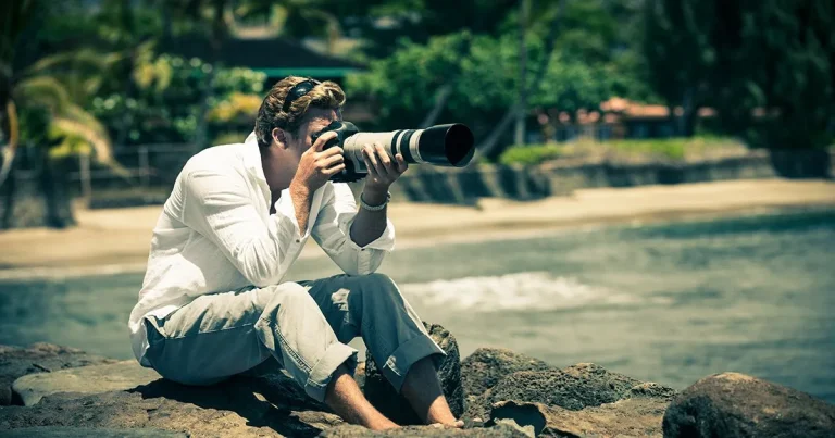
Finally, one of the biggest contributors to visual weight is focus. Sharp areas almost always win over softer ones. If your subject is tack sharp while the larger object remains out of focus, the eye will naturally settle on your subject first.
So now that you’re comfortable with visual weight and how it creates informal balance, let’s look at some examples you can try on your next shoot.
Idea 1: Large vs Small
Let’s start with an idea we’ve already touched on by allowing one half of your frame to be dominated by a large element such as a mountain, tall building, or bridge, while the opposite side contains your main subject, perhaps a person, a cabin, or a car.
Now we can get even smarter with this by introducing another smaller element alongside your subject. Together, they create enough visual interest to balance the much larger object.
For your mountain scene with a human subject, perhaps there’s a nearby tree you can include. If your subject is a cabin, maybe there’s a parked car beside it or an animal such as a deer or birds nearby. Adding another element instantly creates more interest, drawing attention towards that side of the frame.
More importantly, these smaller elements are often where the story exists. They carry emotional weight, helping offset the physical dominance of the larger structure.
Idea 2: Light vs Dark
Light versus dark is something almost every photographer can make use of, including night photographers.
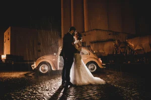
The brighter part of the image naturally attracts attention first, making it the perfect place to position your subject. A bright window with someone standing inside it, a car with its headlights on, or even the moon illuminating a landscape are all fantastic examples.
Perhaps you’re photographing a forest where sunlight breaks through the canopy, illuminating a tiny plant dwarfed by the surrounding trees. Or maybe your subject simply steps into that beam of light.
Night photographers naturally work with light because, quite simply, you can’t photograph darkness alone. By understanding how light contributes to informal balance, you can confidently allow your frame to be dominated by a huge building or skyscraper while your subject is illuminated by a streetlight or neon sign. The viewer will absolutely recognise the building, but only after they’ve noticed your subject first.
Your AI-Powered Photo Editor for MacOS and Windows
Idea 3: Colour
Colour is one of the easiest ways to create informal balance, particularly when photographing people because it’s something you often have complete control over.
I’ve seen many landscape photographers use brightly coloured clothing to emphasise scale. Your eye is immediately drawn towards the tiny hiker standing amongst enormous mountains or valleys.
Bright rain jackets in yellow, red, or blue work brilliantly because they contrast so strongly against the surrounding landscape.
If you shoot in the city, umbrellas are another fantastic example. Brightly coloured umbrellas on gloomy, rainy days instantly help your subject stand out amongst an otherwise grey environment.
You can also use colourful flowers, vibrant cars, or deeply saturated ingredients in food photography to create informal balance. Just remember the earlier principles of colour theory. Understanding which colours naturally advance and recede will help you create harmony in your image while ensuring your subject stands out.
Idea 4: Negative Space
The larger portion of your frame doesn’t always have to be occupied by something. Sometimes it can be occupied by nothing at all, otherwise known as negative space.
Negative space deliberately removes detail from part of the frame, perhaps through open sky, dense fog, or calm water. While that may sound uninteresting, it’s actually an incredibly powerful compositional tool because it gives your subject room to breathe while making it much easier for the viewer to notice it immediately.
A lone hiker, solitary tree, or isolated cabin surrounded by negative space instantly creates themes of loneliness and isolation.
You can even make the negative space itself become the subject. Imagine allowing the sky to dominate over two-thirds of the frame while a small mountain range quietly sits beneath it. The subtle gradient where the sky meets the horizon can be more than interesting enough to carry the entire image.
Elevate Your Photography with Our Advanced Software
Editing to Create Informal Balance in Luminar
We don’t always have complete control over our environment, so sometimes editing becomes the easiest way to strengthen informal balance. Here are some of my favourite tools inside Luminar.
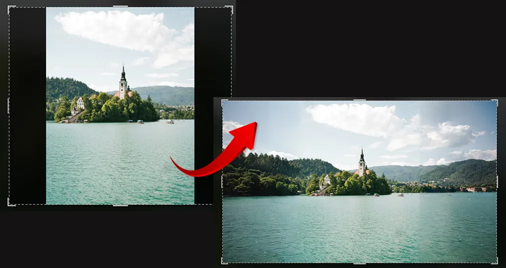
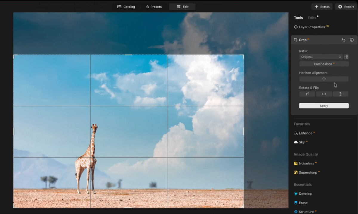
- Crop AI: One of the simplest ways to improve balance is through cropping. Luminar‘s Composition AI can intelligently suggest stronger compositions, or you can crop manually. This allows you to position your subject perfectly, whether that’s according to the Rule of Thirds, the Golden Ratio, or wherever best suits the scene.
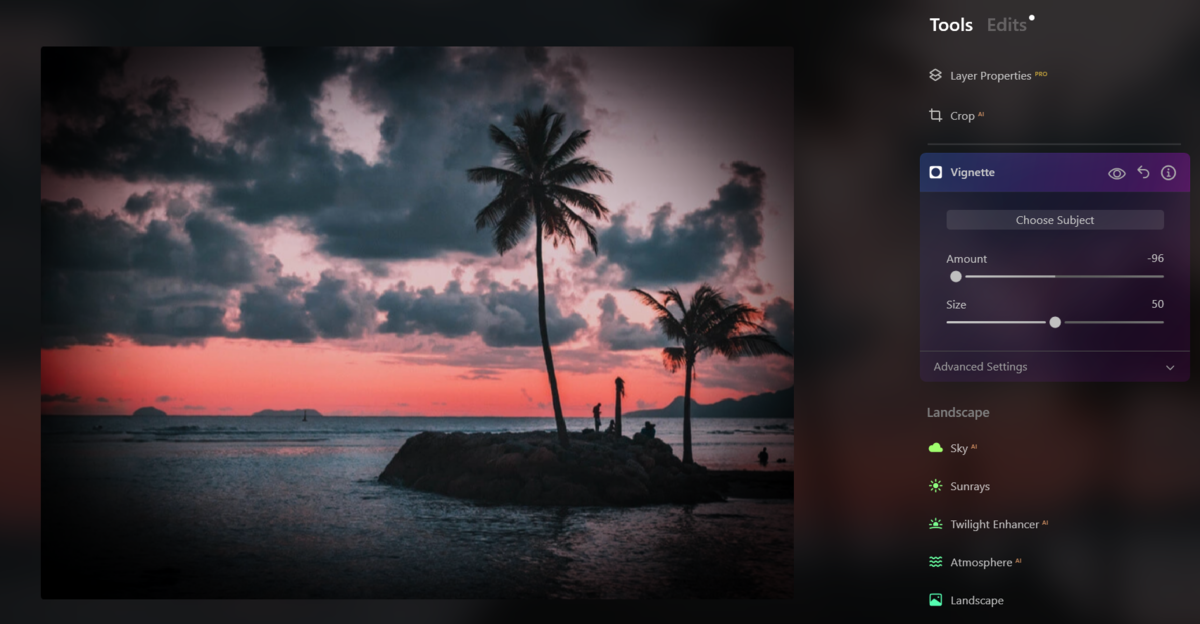
- Vignette: This is another fantastic tool for guiding attention. By subtly darkening the edges of your frame, you reduce visual weight around the corners and naturally encourage the eye towards your subject. Just remember that a little goes a long way.
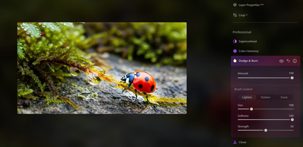
- Dodge and Burn: Remember what we discussed about light and dark? We can reinforce that ourselves using Dodge and Burn. Use Dodge to brighten your subject and Burn to slightly darken the larger element within your frame. Again, subtlety is key. Too much quickly creates an unnatural look that distracts from your image.
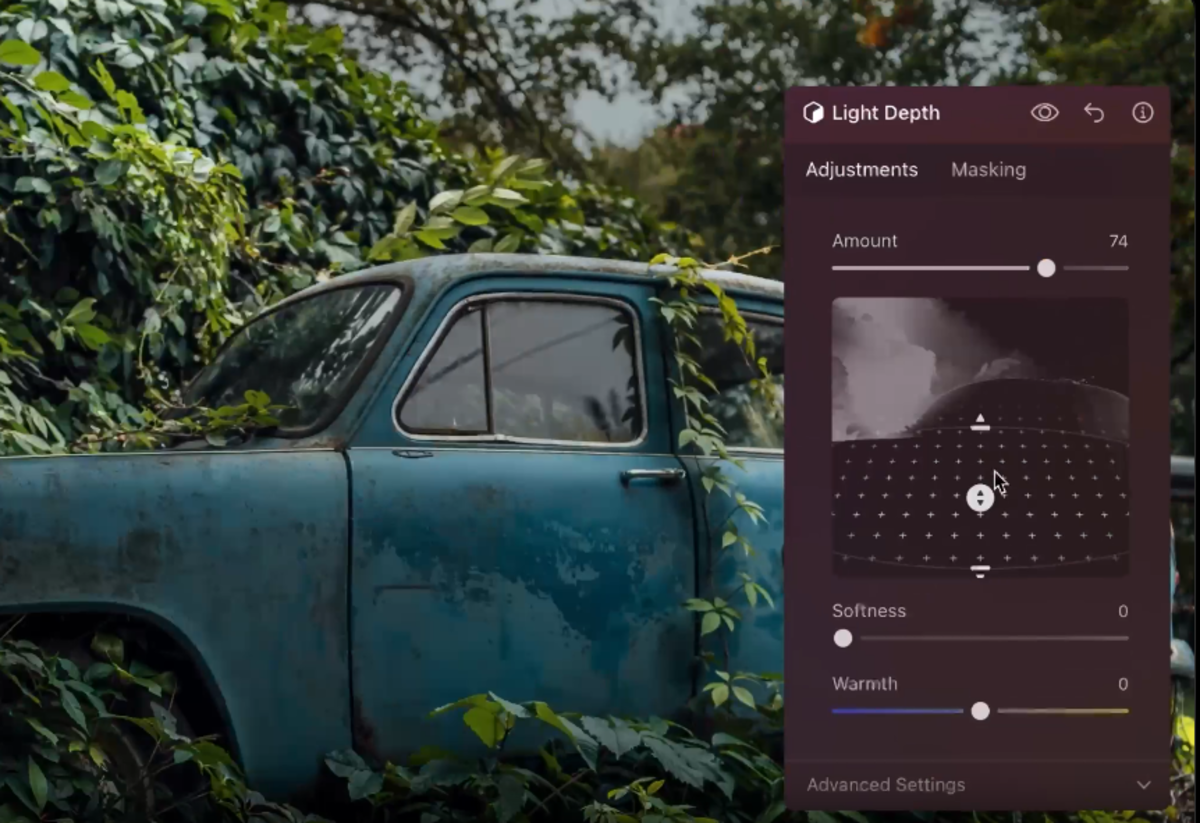
- Light Depth: This tool allows you to relight your image within a 3D space. So you can push a light source through your image and allow it to rest on your subject. Because it works intelligently, it will ensure that light falls and behaves naturally according to your scene, so you can position it over your subject helping it to stand out clearly.
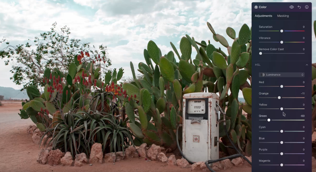
- Colour: Every Luminar tool includes masking options, allowing you to edit your subject independently from the rest of the image. So, if your subject wasn’t wearing a brightly coloured jacket during the shoot, simply mask over it and adjust the hue, saturation, or luminance to help it stand out more clearly against the surrounding landscape.


The Bottom Line
While you may instinctively want to balance every scene through symmetry, sometimes doing the exact opposite creates a much stronger and more eye-catching photograph.
Through informal balance, we can ensure that even the smallest subject in the frame becomes the first thing the viewer notices. Whether that’s achieved through colour, light, focus, or the other techniques we’ve discussed, they all contribute to your subject’s visual weight.
So give it a try on your next shoot. Let a larger element dominate your composition, then use these techniques to help your subject stand out and create a beautifully balanced image.